June 11, 2016
FFF Results Post #456—Panel Presentation 2
On Friday,
CR readers were asked to "Send Me A Panel With No Superheroes In It That's 600 Pixels Wide. Tell Me Four Things You Like About The Panel, One Thing You Dislike." This is how they responded.
*****
 Greg McElhatton
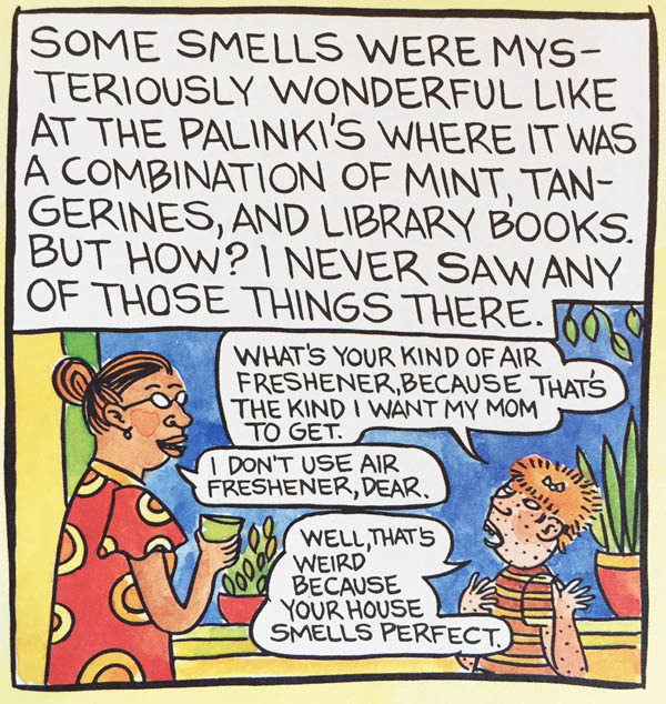
1. I love trying to imagine what a mint/tangerine/library book combination smell would be.
2. The deep blue of the sky through the window entrances me.
3. The casual body language of Mrs. Palinki as she talks to young Lynda is inviting.
4. The way that Lynda Barry sums up a child's yearning for someone else's home/life is spot-on.
5. The freckles on Barry's younger self always remind me of chicken pox and make me want to scratch myself uncontrollably.
panel is from Lynda Barry's One Hundred Demons
*****
 Ali T. Kokmen
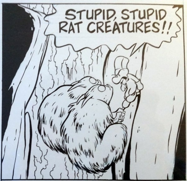
1. I like the lettering in Fone Bone's exclamation, especially the ever-so-slightly-heavily-handed "A" in "creatures," which really sells the gag.
2. I like the wavy border to the word bubble and how it dominates the upper portion of the panel.
3. I like how at this moment, Fone is indignant -- not scared -- at this turn of events.
4. I like the expression on the rat creatures' faces, conveying in just a few simple lines "Oh, we just messed up big time."
5. I don't like that I can't also include the previous panel ("Those rat creatures would have to be pretty stupid to follow me on this frail, little branch!") too. Because as great as this one panel is, it's best appreciated as part of one of the greatest two-panel sequences in all comics ever.
panel is from Jeff Smith's Bone
*****
 Jake Kujava
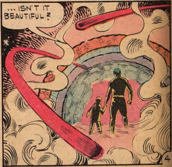
1. Like the smoke weave into the frame work.
2. Like the star patterns in sphere.
3. Like the circles moment.
4. Like how Ditko can fit this all in without making it crowded.
5. Like the abstraction of the unit. Don't know what story this is, don't care. Just like this panel.
panel from a Steve Ditko issue of Captain Atom
*****
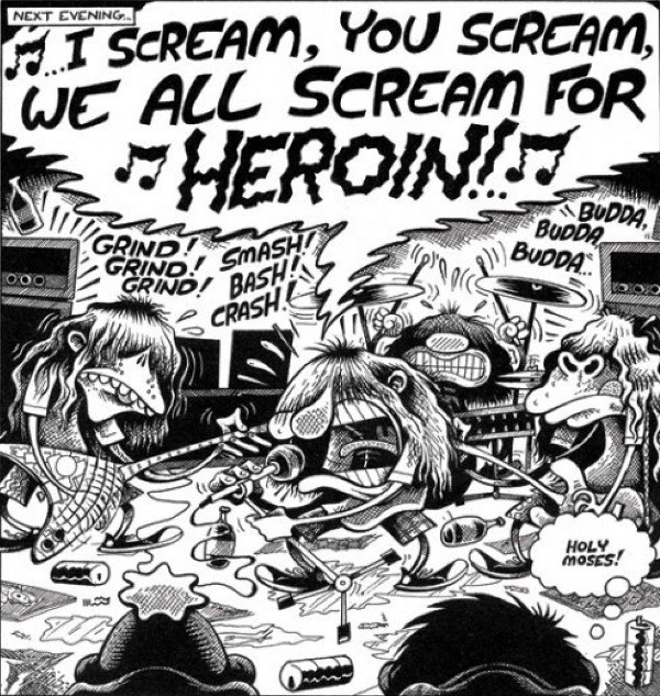 Tom Spurgeon
1. I like that song lyric gag. That's still funny as shit to me.
2. I like the bad hairdos on the band. Bagge's shorthand for shitty, long-hair hairdos has always been the best.
3. I like "Grind! Grind! Grind! / Smash! Bash! Crash!"
4. I like the line "Holy Moses." Buddy Bradley was a great everyman, just weird enough to be distinctive but consistent within the parameters established for him.
5. I have to say, I never really cared for the Stinky hair shorthand. Sorry, Stinky! Sorry, Pete!
panel from Peter Bagge's Hate
*****
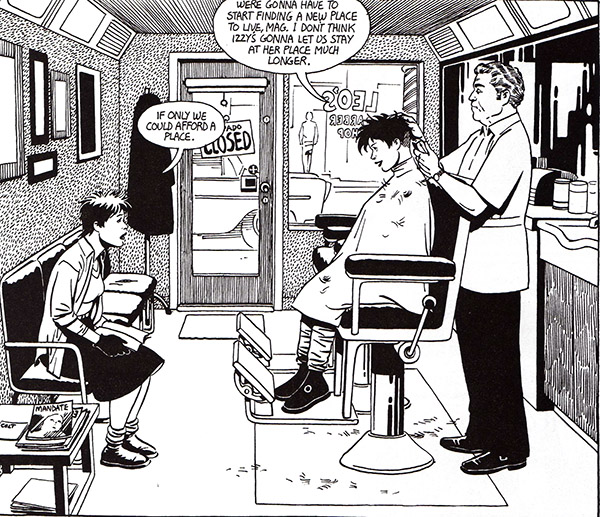 Will Pfeifer
1. I like the way Hopey's head is tilted forward, just like a person's head really is when someone's cutting your hair.
2. I like the barber's wavy hair.
3. I like the pattern on the wall.
4. I like the detail of the stray hairs on the floor and the smock.
5. I don't like the way the two footrests are exactly parallel. Seems too perfect somehow.
Jaime Hernandez panel from Love & Rockets
*****
 Buzz Dixon
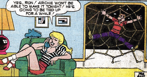
1. When you mention Betty Cooper most people think of a nice, sweet, wholesome girl-next-door who pines away with unrequited love, but true Archie fans know she is bat-shit insane.
2. Seriously, on a scale of 1-to-10 this is Betty at only a 7, at best perhaps an 8; it's a toned down 1970s re-do of a 1950s story that ends far far WORSE!
3. Betty's dialog / expression / pose sell the punchline perfectly, and you know Veronica is exploding with rage on the other end of the line.
4. Nice rope work.
5. There aren't enough panels like this in Archie Comics.
don't know the panel, but it's a 1970s Archie comic, says Buzz
*****
 Marty Yohn
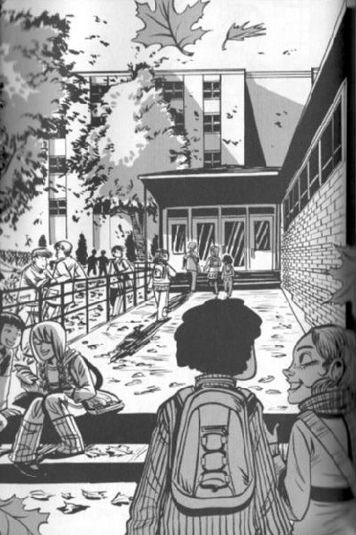
1. It evokes a great mood of the beginning school year.
2. The one-point perspective just draws you into the scene.
3. No word balloons are necessary
4. Black and white with gray washes -- more comics need to do this!
5. I wish the protagonist (Maggie) was a little more defined in the scene - she's somewhat hidden left center.
from Faith Erin Hicks' Friends With Boys
*****
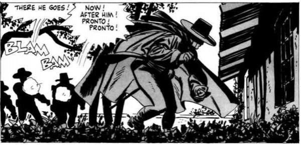 Michael May
1. I like the cape, particularly the side flaring out to the right of the panel.
2. I like the silhouettes of the soldiers against the blank sky.
3. I like the gun blasts; especially one little line suggesting the path of the bullet
4. I like how Zorro looks like he's in mid-boogie.
5. I don't care for the multiple lines used as tails for the word balloons.
you got me, although I'd imagine that's Toth's Zorro
*****
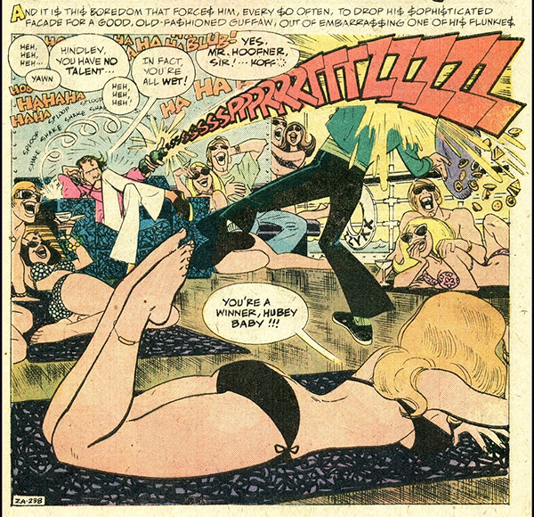 Marc Arsenault
1. Early use of sound effect as the action it is the sound of
2. Toth makes every line count and it all looks so effortless
3. Steve Skeates expresses the same rage at mid-70s excess that fueled punk rock
4. Best lettering in comics
5. caption at top kind of kills the flow.
from Plop! #11
*****
thanks to all that participated
*****
*****
posted 4:00 pm PST |
Permalink
Daily Blog Archives
November 2019
October 2019
September 2019
August 2019
July 2019
Full Archives