Home > CR Interviews
CR Sunday Interview: Steve Hamaker
posted February 10, 2013
Home > CR Interviews
CR Sunday Interview: Steve Hamaker
posted February 10, 2013
*****

I had planned on interviewing the cartoonist, designer and colorist
Steve Hamaker for the last holiday interview series but time got away from me. I'm intrigued by the work he did on
the Scholastic version of Bone, taking
Jeff Smith's black and white classic and somehow making it look like it had been intended for color all along. Readers will soon see two more major projects: work on the
Coldplay comic book version of their concept album
Mylo Xyloto and this year's anticipated
one-volume color RASL book.
Hamaker has lived in growing comics hub
Columbus, Ohio since leaving
Flint, Michigan to attend
college there. Now married and a father, he's there for the duration. We spoke on a recent mid-week early afternoon. -- Tom Spurgeon
*****
TOM SPURGEON: Before we get into things like RASL
and I completely forget about everything else, I wanted to talk about the next project you have coming out. You worked on the Coldplay comic, Mylo Xyloto
. That seems like a pretty good gig. How did that one come to you?
STEVE HAMAKER: It was just lucky meetings with the right people. The guy that's running it,
Mark Osborne, is a movie director.
Kung Fu Panda was his big movie recently. At some point early on with
the Bone movie, Jeff and
Vijaya [Iyer] had met him. He was interested in
Bone and he wanted to interview for the director position for the movie. Jeff and Vijaya were trying to help Warner Brothers find a director. This was years ago, probably three years ago now. He actually came out to Columbus on his own dime, and he went out to dinner with us -- we all went out. That's where I met him. A year after that, he called me out of the blue and said, "Hey... you're a colorist." [laughs] "You want to work on this project with Coldplay?"
It was literally a random call from someone I would have tried to contact if I had known about it previously. It's not like I kept in touch with him after the initial meeting, he just liked my coloring, thankfully. We had other people in common, like
Kazu Kibuishi of
Amulet fame. A lot of the other
Flight guys out in L.A. knew him, so it was like our artist-friend circles were intertwined.
I was the same as you... "Wait, what? What is this? It's a comic based on a rock album? Why do they want to do this...?" [Spurgeon laughs] Of course I said yes before I saw the artwork or anything. I was still full-time with Jeff Smith then. I've been on my own for almost a year now. So it kind of fell into my lap.
SPURGEON: You know, you really haven't done a lot of work outside of the work you've done with Jeff. You've done a few things, but it's not like Mylo Xyloto
is one of a dozen projects you're doing. Was the project appealing to you just because Mark was working on it, or because it was the right time for you to have a gig lined up, or...?
HAMAKER: A little bit of everything. Jeff and I had talked for the last two or three years about reorganizing how I work there, and if I would go out on my own. He knows this, but I don't look at working with Jeff as a stepping stone that gets me to the next level. I was very, very happy working with him on his stuff and being his exclusive guy. I've taken great pride in that over the years. That was very important to me. I do like to work on other things. I don't tend to take projects on just to pay the bills, but luckily great jobs have come easily because of my ties with Jeff. I'm way more interested in doing things I actually care about and with people I like and have chemistry with. I feel like I'm really lucky in that I've been able to do that. I may not always be able to do that, but the last 12, 13 years that I've technically been a colorist, and I've been able to work with people I care about. Little projects with
Terry Moore. Things like that. These are artists that I like as people and also really respect professionally. It's kind of like checking things off of a bucket list, working with these artists. That's really an important aspect of it.
 SPURGEON: What was artistically satisfying about this one? I saw the convention preview pages and they were very pretty. I know that color is thematically important to that story, so you have a chance to be thematically involved there.
HAMAKER: That was really big. You kind of hit the nail on the head there. I actually do like the band, and love that album. The art is done by a guy I've worked alongside before.
Alex Fuentes -- one of the
Flight guys I'd met in passing years ago. For me it's always been, especially with Jeff, that I take color seriously in a different way than just making it look pretty, but in a very storytelling-heavy way as well. I'm sure other colorists feel the same way, colorists like
Dave Stewart. I'm sure he carries themes throughout scenes, and establishes things that weigh into the storytelling. There's also the idea that you don't want people to look at the coloring aside from the line art, otherwise you jar the reader's eyes out of the story. With this Coldplay thing it was actually a little bit of all of that. The story is about color, about the repression of color in this society that punishes its denizens if they think in color or look at color or especially if they use color. It's a very basic story about rebellion, trying to overthrow a government that's trying to boil people down to nothing and use them as energy to control other people they're trying to suppress.
SPURGEON: Tell me about the process early on with a project, when you're putting together a color... a color design
, maybe, for lack of a better word. Do you play around with the colors you're going to use, do you noodle with it? Do you seize on an idea pretty quickly?
HAMAKER: Yeah. I usually take things in scenes. Jeff is very scene-heavy in the way he writes. He has setpieces with specific character staging and backgrounds for most of his scenes. I'm working on
RASL right now, and there's a scene where the spooky girl, RASL, and the president are all talking in the desert. It lasts for eight pages. Those pages aren't going to change drastically from one to another, so the first page will set the tone for that whole chunk of pages. That's kind of my approach, taking the first page of a scene and saying, "Okay, how do I want this to be." You have to think about how the characters will pop against the background if that needs to happen.
The Coldplay project is
so different artistically than what Jeff usually gives me, in that the
Mylo pages are really, really fleshed out with gray tones and blacks. Alex does so much more detail with gray tones and his line art than Jeff does with a lot of his stuff. So it's different for me to color. In some instances it's easier, but then in others it's a different challenge. Every artist's style takes color differently. It's part of the process for me to adapt. Once I establish one color decision, it leads to the next one. You take what you've done in one scene, and that takes you on to the next scene. Obviously you don't want to completely shift the color schemes from one chapter to another. Like the skin tones of the main characters have to look consistent, or you'll throw people out of the story. "Okay, I know that the main character in the Coldplay comic has blue skin; he'll have blue skin in the whole book." Pretty basic stuff.
There are technical things that carry over. It becomes less creative until the very last stage where I'm going in and rendering things. Doing special effects with some of the color parts of the Coldplay comic; it is really special effects heavy. That's new for me. I've never done anything that bold color-wise. Mark was adamant from the very beginning, "We want you to blast that color out." It's a gray world, and suddenly these characters are shooting colors out of their fingertips. That has to really pop. That was kind of hard. There were a few pages at the beginning where they were kind of like, "No, no, it's not enough." And I'm saying, "It's like
Dayglo; are you sure?" [Spurgeon laughs] They made me push it, but I like it a lot.
 SPURGEON: So you worked with a lot of feedback, particularly early on?
HAMAKER: Absolutely. It was with the first two issues that Mark and the artist Alex had ideas. The band chimed in with some stuff, too, which was helpful. Real little things. "Hey, make this more intense." "Change that skin tone a little bit so he looks less similar to the other guy."
It's the same as with Jeff. No one's ever coming in and saying, "Oh, that's completely wrong. Do it over." You just have to tweak. That happens more at the beginning of the project, including the work I do with Jeff. When we start looking at pages, his eyes are fresh. He's giving me initial impressions about the style, because it's so different from
Bone. Once we have that stuff established, the rest of the book is a little bit more "autopilot." "Okay, I've done this scene. I can do this next scene and it won't be that different."
 SPURGEON: I remember very early on when alt-comics companies started doing color, they had to be mindful of how the printers worked, and in some cases what the printer they were using was
 capable
of doing. Do you have to have an idea of how the stuff will print these days, or can printers handle pretty much anything you throw at them now? How much is that on your mind, what the printer can do?
HAMAKER: We went through the ringer with
Bone because Scholastic was printing so many books that we really did have to buckle down and get the black levels correct -- technical things to make it impossible for these printing presses to keep making them without gumming up and becoming blurry and muddy. It was crazy. "Oh, okay. You can't just send them a file. The black layers... every color adds to the black layer, four times on a page and after the 200,000th book it's complete garbage." We kind of made a mistake on the first printing of the first
Bone book. It was not great. It wasn't the coloring; it was the lettering in the word balloons. Like I said, that black was getting hit four times. It didn't look that bad on the color part, because the colors were butting up against each other and blending in; your eye didn't distinguish it. But when you saw those thin letters against the white paper, it was becoming blurry, because the ink was spreading. It wouldn't matter with a print run of 10,000 books. You wouldn't even see that. But because they're doing so many books so quickly, we had to fix that.
To make a long story longer, we had to figure a way to set my files up so that the line art was on its own channel, and the lettering was just black so the last hit on the press was only the lettering. That actually helped us in the future with foreign publications because they could just swap in their own lettering layers. It helped us with other problems, too. By doing all of this stuff the colors were also turning out much closer to the original screen colors . At this point we've done so much work up front, there's never a surprise.
To finally answer your question, in the beginning, yeah, I think a lot more about it. Two things happened. I'm more prepared now to know what I can get away with, and I think technology has caught up to the point where the margin for error is such that you can fudge things a bit.
_thumb.jpg)
 SPURGEON: The color
SPURGEON: The color Bone
strikes me as having been a major, major undertaking. Were you surprised at all that Jeff's artwork took to color like that? I always think of that as one of the minor miracles of recent comics history. This black and white work looked so nice when you moved it to color. Were you surprised that it took to color like that?
HAMAKER: Yes. I don't think I realized when I started that it would take color as well as it did, it happened so quickly and so naturally. For me it was good, since I was self-taught. I had no aspirations to be a colorist when I first started at
Cartoon Books, 13 years ago. I was designing the Bone toys for Jeff. I wasn't even in the publishing arm of their company. That's funny if you think about it because they primarily do books. We were doing toys at the time and products like statues and calendars, so that's what I was focusing on. I've always been a comics guy. In my heart, I always wanted to do my own comics. So I think it was combination of being relieved that it was easy for me to do, but also wanting to experiment and have fun with it. The fact that it took color so well, it was serendipitous. I secretly thought: "Good, because I'm not that good." [laughter]
I wouldn't have been able to color something like Terry Moore's stuff then, because Moore's stuff takes extra effort up front. I don't mean to sound negative about his style, I love Terry, but it was a learning experience to see the differences. His lines are a lot more open and color can have a more drastic effect on his work. Jeff uses a lot of black. He's done a lot of composition work that doesn't require color in the first place, so as long as you're not using completely garish colors -- I guess that's something I can credit myself for, I feel like I do have decent color sense. My overall coloring chops weren't up to the level of stuff I'm doing now, like my rendering techniques, etc. I'm so glad I got bored that one day and tried to color a page of
Bone #1. It clicked very early on, and I'm glad Jeff liked it. The natural look of the color versions was a credit to both me and to Jeff. Jeff's done the work to make it sing in black & white, so it looks amazing in color because he's done that.
We were talking the other day, and Jeff said he can look at
Bone in black and white and appreciate it and he's proud of it, but he loves the color, too. But the stuff we're doing on
RASL, it's kind of the opposite. It's harder for him to look at
RASL in black and white. I think it's because he was approaching it differently as he was starting. The style needs color more than
Bone does.
Bone was hugely successful in black and white, so fans and other cartoonists were threatening me early on to "not screw it up". [laughter] It was sort of awesome to prove myself, and all of those people have since told me they love the color.
 SPURGEON: What is the exact quality in
 RASL
where it seems to need the color more?
HAMAKER: I don't know. I think it was similar to how
Bone started. Jeff had a style in mind when he started with
RASL. If you look at the first couple of issues of
RASL-- we've talked about this, so I'm not throwing him under the bus by saying this -- Jeff was going for a
film noir look, like using sharp angled shadows behind people's heads, but then he stopped doing that as much. The second or third trade paperback, he doesn't do that kind of stuff as frequently. There are a lot more open backgrounds. It creates a different set of problems to solve with color.
If you look at the color version of issue #1 and what I'm doing now eight issues on, it's like I'm following the same path that he did -- because I have to. I'm trying to make the color fit the style page to page. If it's a really involved black and white page with shadows, my colors are going to be different -- more hard-edged than soft-edged. Right now I'm painting the hell out of some of these panels. I'm putting sunburn on their noses, getting every sweat drop. There's so much more detail. I'm not sure why, but I think he fell into a style he was comfortable with after he had been doing it a while. Similarly, the first couple issue of
Bone are very
Walt Kelly or
Peanuts, with all the characters generally walking across the 2-D stage, with flatter layouts and not much depth. Then he got very cinematic in the latter chapters of
Bone. We had the same situation with
Bone when I was coloring that. I couldn't color a page from issue #1 the same way as a page from issue #50. It's a part of the challenge I really like, though. I'm not trying to color consistently for my sake, I'm trying to color consistently for the story's sake.
 SPURGEON: There's a geographical shift, too.
 Bone
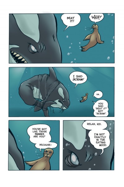
is a fantasy, but it's very much set in that midwestern combination of prairie and forest. RASL
is set in the Southwest. I know Jeff took a trip to that part of the country and took some photos and even published some of them. Did you go on a trip? Did you look at the way light works down there?
HAMAKER: A year ago I was going to take a trip, and schedules didn't work out. I got busy. I got married and we had a baby, both in the same year. My life went from zero to a million. [laughs] It was hard for me to take a shower every morning, let alone go to Arizona and spend a week in the desert by myself. [Spurgeon laughs] I wish I could have gone and taken a journey into the desert for research. I know it would have helped. There's beautiful stuff there where Jeff has taken pictures -- even just watching
Breaking Bad I'm like, "Look at the colors. Look at the sky." I'm doing my best though! I'm channeling as much as I can without actually spending time there. I didn't get to absorb the desert like he and Vijaya have. They have family in Arizona, so they've spent a ton of time out there.
SPURGEON: You've mentioned that you're working on your own now, and that you have a family. What is the professional outlook then? Is what's in store for you more freelance stuff like the Coldplay book? Is it your own comics like the work you had in the Flight
books? What is the ideal for you moving forward?
HAMAKER: My ideal situation is pretty similar to what I'm doing now except for the terrible deadline I'm on. I'd like to be involved with whatever Jeff is doing in the future. When we get this book done we'll have to reassess and figure out how best to work together. I still stand by the idea that I'd like to continue working with Jeff as long as he wants me around. I think our stuff looks so good together. It's a collaboration that is worth continuing for my part at least.
 SPURGEON: You did some problem-solving stuff for Jeff, too. I remember seeing pages of
 RASL
where he would leave indicators for you to move visual elements around the page. It seems like you had a pretty fluid working relationship in a lot of ways.
HAMAKER: Yeah. While he was working on the black and white... let me clarify that. It's interesting, but it's good to make sure people don't think I'm inking his pages or anything. When he worked on
Bone, Jeff did what he would call "Xerox Technology." He would take a background and Xerox them off to put them behind the characters. He was repurposing drawings, but there was an art to it that he taught me. He was on terrible deadlines then, so that was something he had to do regularly. He had his own copying machine in his studio, and he would take trips to
Kinko's -- whatever he had to do to get that done. When I came along, he realized that I could do a lot of that stuff on the computer with me. Especially when we started scanning the pages. He was old school, man. He used to send original pages to Canada and have them photograph the pages. "Please send them back!?!?" [Spurgeon laughs] That just doesn't happen anymore. Now we can just
ftp or
dropbox them.
We all realized together that we were scanning these pages anyway, to color them, so the real pages are the digital pages. Jeff realized that he could have me do the blacks. There were big areas where he didn't have time to do the painting; he would have me do that. That's where it started. Then we would do more things and it just kind of built on itself. He trusted me to have me build setpieces or do skylines using a few drawings scattered over bits of bristol board -- change them slightly. There really is an art to it, because you don't want people to know it's the same three or four drawings. Even if you look close and discover them, it doesn't hurt the story.
We had fun trying to trick people's eyes. He would do a bunch of drawings and hand them to me and say, "Put this stuff together." One good example is some of the history pages from
RASL. The collage-style things, where there's a picture of
JP Morgan and then a bunch of stuff next to them. I would compile that for him. He could say yes or no, and we would work together. It's sort of an unsung hero situation where I'm like, "Yeah, I helped on the book, too. I'm not just a colorist." [Spurgeon laughs] I honestly don't care. It was fun to do that stuff, and help out. Jeff is like my mentor, so it's fun to see his process, and to actually contribute in that way is a unbelievable.
 SPURGEON: I have to imagine you're a wholly different cartoonist just for working so closely with Jeff. You got to take comics classes with Jeff Smith for years and years.
HAMAKER: Exactly. Everything I've learned there I've used in my own stuff. I've done a couple of stories for the
Flight anthologies. I showed Jeff all my sketches and my story notes. He helped me with my
Fish And Chips graphic novel back in 2001. He's been hugely supportive. Not just an influence on his own, but really helping me. We always sit around and talk about how to fix the
Star Wars prequels and things like that -- talk about storytelling, talk about comics. He's definitely been a huge influence on me as a cartoonist and writer. It's been great for me. As far as my own stuff, and what I feel like doing. It's pretty low-key right now because I'm so busy with the family. But I do have some ideas that I want to tackle -- bigger projects I'd like to do on my own.
Like I say, I don't really view coloring or cartooning as one thing or the other to be known for. I don't think "I don't have time to color any more because I'm doing my own stuff." I don't really feel like I've ever had that attitude. I'm very happy as a colorist, and I'd be happy continuing to do that stuff for other people. At the same time, I will do my own comics and publish them however I can. I'll probably have an online comic starting up later this year. I have a huge graphic novel project that I'm trying to organize right now, and then pitch to publishers. We'll see how all that stuff pans out. It's hard to see the light at the end of the tunnel right now with my current deadlines. Once I get to
Comic-Con, I'll be able to clear my head. Ask me again when we see each other at Comic-Con.
SPURGEON: I remember we had an exchange where you referred to working with Jeff as the thing that allowed you to stay in Columbus. You're pretty ensconced there now. You're there for good barring a massive life change. Are you comfortable in Columbus? That's where you went to school. Is that a nice place to start this next chapter of your life?
HAMAKER: Absolutely. As soon as I moved here for college I fell in love with the city. It's a really good balance: we have a great downtown city life, but you can still see the sky and the horizon. Columbus has everything I've ever wanted. The comics scene is really strong here, so it feels right. I met my wife through Jeff and Vijaya. They're heavily involved with
the Billy Ireland Cartoon Library where Jeff donated the Bone art collection, and that's where I met
Jenny Robb, who's the curator now. We got married last year and now we have a baby boy. Seriously... It's been crazy. I have an amazing family and life. So, yes, I love Columbus. I would definitely recommend Columbus to anyone.
*****
*
Steve Hamaker
*
Mylo Xyloto at Bongo
*
Cartoon Books
*****
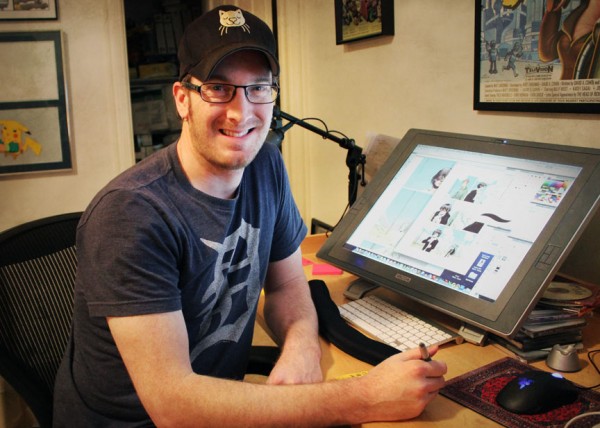
* photo of Hamaker provided by Hamaker
* the
Mylo Xyloto cover
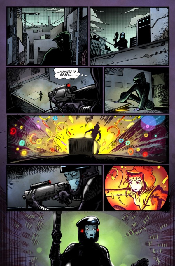
* a
Mylo Xyloto page provided by Hamaker
* a pre-colored and colored
Mylo Xyloto page, also provided by Hamaker
* panel from a tutorial Hamaker did for Scholastic
* two example of color from the Scholastic version of
Bone
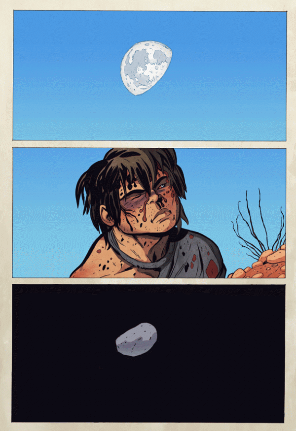
* a
RASL color image provided by Hamaker
* a
RASL page before-and-after, again provided by Hamaker
* one of the scenes where Hamaker did some work for the black and white version of
RASL; the guards were re-used
* a
Flight page by Hamaker
* Hamaker's Fish N Chips characters [below]
*****
*****
*****