
December 21, 2006
Holiday Interviews #4: Jacob Covey
An Interview With Art Director Jacob Covey
By Tom Spurgeon
I happened to be doing a couple of weeks' work at the Fantagraphics office when Jacob Covey started working there; I figured he'd be a memorable employee, although whether he'd be a bedrock or a famous flame-out I couldn't tell. Turns out the former was true, as Covey has gone on to art direct some of the best work to come out of Fantagraphics during the company's current WW Norton era: books like
Chewing Gum In Church,
Dennis the Menace, and the
Popeye volumes. The last of those three projects, with a first volume boasting a surprising die cut and an impressive hardcover, over-sized design in general, is a real show-stopper.
I was interested in talking to Jacob because 1) art directors are probably the least talked-to, most important people in modern comics, and 2) January sees the release of Covey's
Beasts! book, a giant book of illustrations and captions about "real world" creatures and perhaps-monsters. It's a nice-looking volume, with an impressive line-up, plus it's a whole lot of fun. I enjoyed interviewing Jacob Covey, and I'm glad I was at least half-right about him.
*****
TOM SPURGEON: So: where the heck did you
come from?
JACOB COVEY: The Buckle of the Powerbelt of the Great Northwest:
Wenatchee, Washington. I got my Associate's Degree in Photography, was sort of a rock photographer for a while, then studied Graphic Design for my B.A. My first year out of school I moved to LA to work for a skate company, disliked it, and moved to Seattle where I worked at a shoe company doing horrible ad work and the like. I originally interviewed for
Fantagraphics but they took six months to decide to hire me. I'm not sure what it was they didn't like about me because they were looking for someone. Apparently they weren't looking for
me. I kept calling
Gary [Groth], interviewed with him, called him, called him. Eventually it worked out.
SPURGEON: Are you happy with the way Beasts!
turned out? What was the experience like of doing that book?
COVEY: The entire process was incredibly rewarding and exhausting. The generosity of the artists has actually made me cry. I suppose I'm too cynical but the fact that this book is a wish list of busy artists that all made time for the subject is really moving. And, cosmetically, the book is very pretty because, well, nobody is getting paid. I'm on staff and did most of it on my own time and paying 90 artists for creating original art was unfeasible. All of us did it because the idea resonated with us and I think that says a lot. The subject is a collection of cultural stories, symbols that are deeply a part of us as people.
I'm very happy with the result, although it printed too dark. It's great to see all of the artists doing some of their best work because there was no editing. I took what they gave me and I think it's probably the strongest "concept" art collections I've ever come across.
 SPURGEON: Beyond the current art exhibit, are you planning on doing anything else in support of the book? Touring?
COVEY: I would love for the whole entity to grow outside of my vision for it but I have no energy for coordinating a touring exhibit. I co-curated a couple of gallery shows for the Chronicle Books "bible of rock posters,"
The Art of Modern Rock, with the guys putting together the Beasts! show and I learned it's too difficult. 3-d is not my medium and organization is my greatest weakness. There will be signings in some of the big cities.
SPURGEON: Tell me about putting the book together. How was it originally conceived, and who did you decide to ask? Did you know most of the artists? Was there any thought of balancing known cartoonist with illustrator/painter types, or did you just approach who you asked in terms of broader visual appeal?
COVEY: First of all, Gary wasn't convinced the idea would work and I think he was really just doing me a favor when he approved it. With his history of pulling off unlikely ideas that made me pretty uncertain about the project. So I started with the few artists I was friends with or acquainted with. They turned around some art quickly and it was remarkable. The idea suddenly took a form and my confidence grew with each new submission. People were ridiculously excited by the idea and eventually I had the likes of
Tim Biskup who can do anything he wants and here he is making a painting of some weird Egyptian chimera that I found an old reference to.

I think it was a conscious choice to have diverse artists for the book in that I am not steeped in any particular genre of illustration and art. I'm the least knowledgeable person in the office when it comes to comics and at the skate company it was the same story about that world of that kind of illustration. So I get bored with 'genre' art books. I hate lowbrow but I love some 'lowbrow' artists. Some comics can be just as insipid as some lowbrow. But good art is good art and deserves an audience. There are people in the book who have never been published.
Corey Lunn was one of the last people I asked, for example, and there was no 'commercial appeal' to that decision making. I tripped over his work online and had to track him down through somebody just to ask him. I love his piece. Luckily people like
Dave Cooper weren't concerned with "who are these other people?" and I could get away with that.
Come to think of it,
Kaela Graham had never published (which is ridiculous) and that was the one piece Dave asked about early on. He liked it, so I guess that's a good thing.
I actually didn't know more than a handful of the artists on any personal or professional level. Funny thing is, only a dozen people or less said no and they were mostly Fantagraphics artists. Maybe they're a bit tired of charity work! Or, understandably, they're interested in reaching another audience and figured this wouldn't.
SPURGEON: How did you put together the supplementary material? How did you end up with Gilbert's strip?
COVEY: Well, all of the creatures are "real" in the sense that I culled the material from historical material -- bestiaries, encyclopedias, news articles, and such. So the writers wrote all the material up more legibly than I ever could. The rest of it is incidental blathering on my part. The writers also had the initiative to make that strange chart in the back of the book which classifies the 90 creatures. I hunted down Marvin K. in Wisconsin, the eyewitness to the
Beast of Bray Road, and asked him to contribute a sketch of what he had seen driving home one day in the '80s. And, lastly, Felicia Gotthelf knew of
Daniel Taylor-Ide who she interviewed for the book. He spent most of his life researching the possible existence of the yeti, which is fascinating.
As for Gilbert Hernandez he was made for this book. He is dealing constantly in the realm of Jungian symbolism, of cultural myth, and magical-realism which kind of explains these things. However, he was one of the people who I couldn't get to respond to my emails. At the last minute
Eric Reynolds had him agree to me reprinting five panels of his six-panel "seahog" story. His is the only art not original to the book but it also gives a nice narrative to start off the book and give the reader some orientation as to what the hell these images are.
SPURGEON: Were there any books you had in mind when initially putting this together? Were you a fan of the fantasy art books that were popular in the 1970s? Are there books you consider of a type?
COVEY: You know, I'm not a fantasy fan. If anything I dislike the whole genre of D&D, SCA types. There are no dragons in
Beasts! and I'm glad for that. I'm always interested in the encyclopedic quality of the
D&D guides but the art is lame and I prefer the more pop stuff --
Famous Monsters,
Jack Davis types of things. But that wasn't the intent of this book. The pop culture stuff is fantastic but I wasn't interested in presenting anything 'made-up' from the mind of one person. I wanted the stories born from our collective unconscious. I think what I had an idea for is so obvious that it doesn't even seem novel: Take the cool creatures back from the dregs of
Heavy Metal magazine and Fantasy conventions. Much more of an influence were the classical bestiaries. Hence the predictable design, with gold gilding and stuffy type treatment.
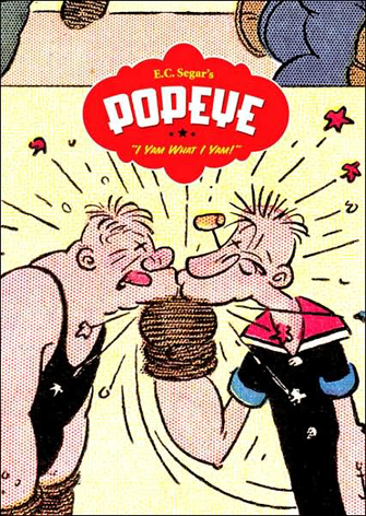 SPURGEON: That Popeye art direction has been really well received. I saw some early concepts. Can you talk about how your idea for the book's design developed as you worked on it?
COVEY: The early concepts that you probably saw were me rushing to produce ten book covers in two weeks. That's what happens for solicitations catalogs at an understaffed publisher. If I'm lucky I get enough time to do better treatments later on.
Popeye was frightening for the fact that Gary was giddy about it. It clearly meant a lot more to him than most books and everyone reveres Segar.
I mean, people have asked if I was disappointed that I came on staff after
Peanuts was released and I tell them I'm grateful that I wasn't here. Thank God Seth took that on. He was savvy. He's a smart designer and it's so solid I would never have had the nerve to take it into that dramatic territory -- certainly I could do nothing better. In the case of Popeye what I knew for sure is that it had to be assertive and unapologetic in its presentation. At one point I almost settled for "good enough," but Adam Grano works here next to me and he gave me his usual disapproval of my half-assery and I pushed onward. I do crave making the package an extension of the content. I wait for that moment when it seems to.
You have no idea how grateful I am that some people think of that design as succeeding at reaching the rabid fans as well as little kids, while remaining unique looking.
SPURGEON: That die cut was a real masterstroke. Where did that come from? Was there any reluctance to do that kind of bold move considering the rough way books can be shipped in the direct market?
COVEY: I comped up four covers for the book. This one is kind of flat when you look at it onscreen and I think The Bosses preferred others. The only reason this layout worked was because Gary and Kim love the strip and would pay for the cost of production. The die cut works with that image, specifically. I'm not sure if the other five books in the series will work or if the concept will fall on its face. But Popeye has a temper and in that image he's so out of control that he's popped himself in the jaw along with his opponent. The cover ended up punched right through as well. It really did come down to that. One of those things where the image itself came up with the idea of the die cut. It definitely helps make a viewer reconsider their idea of the commercially predictable
Popeye.
Questions were asked but the resilient thickness of that cardboard cover seems to put to rest fears about shipping damage. Or it's just another example of Kim and Gary putting integrity ahead of marketing. I'd say 50-50. There was much more debate about my suggestion to print the title of
Locas only in spot varnish but if there's an artist who doesn't need words cluttering up his gorgeous line work it's Jaime. That book is so much better with the art speaking for itself across a crowded book store.
I think Kim (Thompson) has actually been great-- lately we seem to have the same idea on production issues and he makes really important suggestions.
SPURGEON: Working with the material, do you have anything to say about Popeye himself? Do you find yourself entering into a relationship with the material you work on?
COVEY: It's strange how much you get involved actually. Doing book design is the most rewarding work I've ever done. It's always best to work on in-house projects like Popeye because there are no editors or artists to wrestle with. I only have to convince the people here, people who know I'm very serious about what I do and trust me when I feel strongly about something. Because I don't do things willy-nilly. I'm quite uptight and I design as a response to the nuance of the work, however bullshit that may sound.
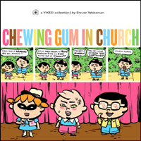
Anytime packaging involves another person it becomes muddied. If it's an artist I'm not confident enough or good enough with sales pitches to try to put too much of an imprint on their vision for their book. At times, like with Steven Weissman's
Chewing Gum In Church, the artist clicks with me and vice versa. I love that book. It's really fucked up without being overbearing. I'd never have done all those color changes on the pages and type if he weren't so trusting (and it didn't echo his strips). Even in the way that every page has the page number on it twice. It totally compliments his off-kilter world but he trusted me with that even when both he and his wife were dubious.
Most outside editors are just a nightmare. I don't know how to talk to them. I think most people don't trust graphic designers and, frankly, in this day and age they generally shouldn't. "Oh! You're a designer? My neighbor's dog is a graphic designer!" On the other hand, I think editors can be too territorial and get a kind of vicarious identity from aligning with the work, which leads them to fear presenting it in some way other than the most inoffensive way. Afterall, some people hate the Peanuts design but damned if it isn't reaching a remarkable number of new readers who see so much more in it because of the effectiveness of Seth's treatment.
 SPURGEON: Your Dennis the Menace series design is somewhat similar to the classic look that Seth's design for the
 Peanuts
books, but without falling prey to the criticism facing IDW's Dick Tracy
series in some circles. How did you approach that project and are you happy with the result?
COVEY: Certainly the
Dennis design is complementary to the
Peanuts design, which was sort of necessary in my mind at that time. I'm still coming into my own and I'm not shy about saying that: 1)
Dennis is probably influenced by Seth's
Peanuts designs, although of a distinctly separate aesthetic tone and 2) the
Dick Tracy presentation is the epitome of a crass rip-off. It's a classic strip far from the world of
Peanuts and deserved a far different treatment. I can't think of another design hijacking that is quite so clear cut or parasitic.
But anyway...
Dennis was exciting. Gary and I went down to the famous California golf course,
Pebble Beach, which he was unfamiliar with. I loved that he was way underdressed in his usual tucked-in t-shirt, belt-less and highwater jeans, and sneakers talking intellectually about
Robert Crumb to a woman eating crab salad. We presented to
Hank Ketcham's widow, walked around his house, toured and dug through files in his studio, and I urinated in his toilet. In fact I text messaged my friend Angela as I did that it. It was a milestone, as pissing sometimes is.
The former Ms. Ketcham was very kind and gave me much more creative freedom than I had expected, essentially accepting my designs
carte blanche. I was thrilled to reinvent the look of this American icon who had such a garish Dairy Queen persona with primary colors that choked the life out of Ketcham's lively brushstrokes. And it's great, because
Peanuts has had a lot of looks over the years, no specific identity tied to it, but Dennis has pretty much had that one look from the start so it's a very rare opportunity.
The book is fun but conservative, as it should be, as Ketcham was. But it also harkens to the nostalgic '50s-'60s with the uncoated, papery cover stock, the color schemes, the design in general. That ribbon bookmark fails to seem pretentious because of the sheer size of the book, which is nice. The dates aligning as a timeline on the spines makes me feel good about the set. And, actually, that cover stock is a good example of intercession on the part of the distributor. We had to coat the cover so it wouldn't be prone to ripping. My solution was to just flip it over -- the coating is on the inside, unseen part of the cover.
SPURGEON: Now that you've had a couple of years, what's it like to work for Fantagraphics? Are you going to be able to stay there for a while?
COVEY: I took a huge pay cut to be here. Huge. To the point that I can't seem to let that go and I don't know how my wife and I will pay the heating bills this winter, but I've never regretted it. Books are artifacts of culture on a level like nothing else and I feel lucky to be here when a project goes well. I admire the integrity of Fantagraphics, my work is fulfilling, and I don't grind my teeth at night anymore. So I'll be here in some way for years to come I should think, although I may need to find a way to do more outside work for money. I do freelance work and enjoy that but Fantagraphics has been supportive and as long as it's rewarding I want to be a part of it. If it gets to be rigmarole I'll probably flip out, take another pay cut and work for another poor company.
SPURGEON: What are your plans for the holidays?
COVEY: I have no exciting plans for the holidays. Or unexciting ones, really. We'll visit family and friends and I'll work too much.
SPURGEON: 2007 and beyond, then. Are you going to do more works like Beasts!
?
COVEY: I don't know. It really was exhausting. I butchered the opening pages of
Beasts! out of a complete inability to grasp the book by the end of it.
I'd like to do a book called
Bears Versus Horses but I think it would be disappointing to everyone but me.
SPURGEON: What do you think of comics designs in general, in this great rush of everyone breaking into bookstores? Are there other designers out there you admire? What do you think makes good design in terms of a comics trade?
COVEY: Comics design is in a good place. It's now on par with other literary and arts fields, as it should be. There's really great work and then there's a herd of people aping another graphic novel's design whether it makes any sense for their book or not. That's an unfortunate truth in all genres so it's not something to scrutinize too much here. Design is inextricably linked to the perception the masses have of an object and it's only getting stronger in the field of comics.
As much as anything, good design says that somebody is taking this object very seriously. It is crafted. And popular culture is taking more notice as the 'face' of comics is elevated. It helps that without question the strongest graphic designer of our time also happens to be a comics artist, namely Chris Ware. But there's a danger in cartoonists/graphic novelists not delineating between the two fields. A lot of illustrators are horrible designers and they do themselves (and thereby the medium) a terrible disservice when they don't delineate between the two skill sets.

On the other hand you have the most recognized and dexterous graphic designer in popular culture heading up the most commercial publisher of graphic novels, namely
Chip Kidd at Pantheon. So popular culture at large is paying a
lot of attention to comics culture and everyone is throwing out the most production-conscious book possible, often without regard to the tone of the work. I keep seeing these really classic typefaces sort of thrown on an uncoated paper stock cover with French folds and minimal artwork only to open it up to art that has nothing to do with the emotional mood that sets up. I'd love to see smarter design, not just "good" design. For god's sake please make a funny book look like a funny book!
In any case, I accept that I'm not the genius who will remake this industry and I'm just glad people are reading these things more. While everyone is looking to the galleries for the next great art movement, here it's been happening on Xerox machines and crept its way into the full-color corners of your book stores. It's great to be a part of it now.
*****
*
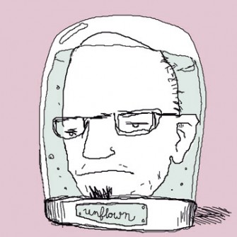
drawing of Jacob Covey by Adam Grano
*
Beasts! cover
*
Renee French's Bigfoot from Beasts!
*
various Fantagraphics titles, identified on covers
*
photo of Chip Kidd by Whit Spurgeon
*****
Beasts!, Jacob Covey, Fantagraphics Books, Hardcover, 200 pages, 156097768X (ISBN), $28.95.
*****
Jacob Covey's Personal Site
Jacob Covey's Present Employer
*****
*****
posted 12:54 am PST |
Permalink
Daily Blog Archives
November 2019
October 2019
September 2019
August 2019
July 2019
Full Archives


