
June 7, 2009
CR Sunday Interview: Seth

*****
I'm a great fan of the cartoonist and designer
Seth, whose comics I've come to enjoy more and more over the years. He has what would be for many artists a decade's worth of projects either recently out or imminent:
George Sprott, 1894-1975, a book-length expansion of
his New York Times Sunday Magazine novella and a work that features some of his best cartooning to date;
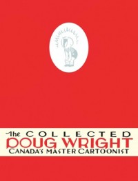
The Collected Doug Wright, Volume One: Canada's Master Cartoonist, which he designed and I believe edited; various volumes of
the John Stanley Library for
Drawn and Quarterly, featuring his design work; a short comic for
Kramers Ergot Vol. 7 on
Thoreau MacDonald, a two-page comic on a giant canvas that shows off more of his cartooning chops; and two more volumes of
The Complete Peanuts, a series on which his design work has set the standard for this new era of deluxe strip reprints. I'm probably forgetting like five things.
Seth
is currently on tour with fellow cartoonist
Adrian Tomine -- you can catch him at
the MoCCA Festival the day this interview rolls out -- but stopped before taking off to answer a bunch of my questions about this avalanche of recent and forthcoming work. It's always a pleasure to interact with him, and this was no exception. -- Tom Spurgeon
*****
TOM SPURGEON: I think most people are aware that George Sprott
began as one of the New York Times Sunday Magazine
serial projects, and more than a few are aware that this is the potential project you offered the Times that had the least amount of initial interest for you. What led you to include the Sprott
idea at all?
SETH: That's a valid question. It does seem like a poor idea to toss in an idea that you don't particularly wish to be picked (though that overstates it -- it was merely my least favorite idea of the three submitted). I have learned, from years as a commercial illustrator, that you don't submit any rough drawings you don't like because it is a fact that the art director will
always pick the one you hate. The truth is, I tossed in
George Sprott because I felt I needed to present them with a third option. Let me explain.
I gave them three choices. Choice number one was to continue and finish a story I had begun in
Toro Magazine but had left unfinished due to a conflict with editorial. Choice number two (my favorite at the time) was a quiet, meditative study of a block of abandoned buildings. I looked over my first two choices and instantly knew that I needed to give them a third. It was pure strategic thinking.
They were
not going to pick number one -- they wouldn't wish to continue something begun elsewhere -- I just knew that. And number two was a shot in the dark. Probably too "poetic" for them. Too artsy. It seemed obvious that there had to be a third option that was a more traditional story and had some human characters in it.
Sprott -- a rather unformed idea at that point -- was what was currently floating around in the back of my brain and therefore,
Sprott it was.
I actually kind of figured they would pick it, but I was still hoping against hope they would go for the second option.
As I have said elsewhere -- in the end -- they were correct. Working on
Sprott was the more challenging choice and ultimately, the more rewarding for me.
 SPURGEON: Also, as it began to develop, where were you creatively at the time and what was going on that had an impact on your general approach? I've heard people mention a number of things that might have had some effect: an approach you learned by doing
 Wimbledon Green
, the Dominion City project, the theme work in Clyde Fans
, even.
SETH: Well -- at the very moment they called I was working on
Clyde Fans (naturally) and I had just made a solemn oath to devote all my energies to finishing it up immediately. Sigh. How could I say no to the
Times? It was too good of an opportunity to turn down -- though I did consider it.
Creatively,
Sprott follows naturally out of
Wimbledon Green. In many ways, I took the lessons I learned making
Wimbledon and applied them directly to
Sprott. I suppose
Sprott is clearly
Wimbledon Green meets
Clyde Fans... but, really, all my work is pretty interchangeable. It's all of a piece. I don't really think of each book or project as something new, I simply see it all as part of a continuum. I'm working my way down a very specific path and each work is a refinement of what has come before. It's all towards a goal of trying to put down on paper the very specific feeling I have of being in the world -- trying somehow to get my inner reality communicated to the outside. In the end, every project fails but I get a little closer to understanding how to approach things in the next work.
When I did
Wimbledon Green, I made it a point to mention in the introduction that I was trying to emulate a narrative approach I had come to enjoy in the works of
Clowes,
Ware and
Heatley. The use of short, separate strips that build up to bigger picture when read together. And that was perfectly true -- that
is what I was doing -- applying what I had seen and liked in their works to a little sketchbook story of my own.
But the funny thing is, after
Wimbledon was published I remembered something. Back in the '80s I had heard
John Cage's Indeterminacy on the radio -- 90 unconnected stories told in 90 minutes. This work had had a huge impact on me and for years I had thought about trying to do something similar in comics form -- perhaps 50 unconnected one-pagers that the reader would put together in their own mind. It was an idea that sat on the backburner so long that I forgot all about it.
I can recognize now that seeing these other cartoonists using a similar narrative approach (to
Indeterminacy) is what drew me over to emulate them in the first place. They had actually put into application this old forgotten notion of mine -- done it so brilliantly that I had failed to recognize why I was so attracted to it. I had forgotten the Cage connection entirely. In fact, I hadn't thought of
Indeterminacy even once while working on
Wimbledon.
But, by the time
Sprott came along, I had remembered this youthful notion and I thought, "Here is an opportunity to apply what I have learned from Ware, Clowes, Heatley and
Wimbledon Green --
and John Cage -- to a new story." A piece that was less centrally organized -- more fragmented -- closer to my original Cage idea.
SPURGEON: I haven't heard too many people talk about the experience of having that platform. What was that experience like, appearing in the Times
? Did you hear back from a different kind of reader with a different kind of reaction to your work?
SETH: I wish I could give you an exciting answer to this question -- but the reality of a cartoonist's life is that you sit in a studio all day and you send the work out and you never hear a damn thing about it again.
I had an excellent working relationship with the
Times and it was a very valuable experience doing the strip -- I learned a lot about editing my own work while doing
Sprott. But I cannot say I received a great deal of response to the work while it was running. Since it finished I have received a smattering of remarks here and there, nothing much worth commenting on. As an artist you like feedback but I have learned not to expect it. That's one sure way to be disappointed. I must say, though, that the high profile venue was a "feather in my cap" and I have "felt" some vague effect from having serialized a strip there. Hard to explain what I mean by this, though. The lack of direct feedback may simply be the nature of newspaper and magazine publication -- I mean,
George Sprott (the book) has only been out a couple of days and I have received significantly more feedback than during the entire run of the strip.
I think, sometimes, people think a high profile "gig" of this sort is like appearing on the Broadway stage or something -- excitement and applause. The sad reality is that you are just sitting in the basement, the same as any other day. You don't actually see anyone read the thing. The Prime Minister of Canada doesn't phone you up and say "Good Show."
I resisted Googling the strip for its entire run but when it ended I typed in the title. The very first "hit" said: "Thank god,
George Sprott is finally over." And people wonder why I dislike the Internet.
SPURGEON: What was your relationship like to the work while you were doing it and how has that changed since? Was there ever a point where you struggled with or simply didn't like the work? When did it click for you?
SETH: Like any work, it's an up and down process. Some days you think it is the best thing you've ever done and other days you think it's a piece of drivel. I was on this roller coaster the whole time I was working on it. I think initially, after I started working out the first few installments, I was very enthusiastic about the strip. I thought it had a lot of promise. Certainly, at that early stage I felt real genuine confidence that this was going to be the best thing I had ever done... but somewhere in the middle I recall feeling quite blue that something was missing from the finished work. Some nebulous quality -- something I couldn't put my finger on -- was failing to appear. I recall sitting down and doubling my effort there, to bring it to a higher level and, by the end I recall, I felt pretty good about it.
Sprott was actually pretty tightly planned from the word go -- but there were points where inspiration was stronger. I felt I was getting at something when I did the strip titled "The White Dream."
That same roller coaster of emotion carries on for me after the work is finished, as well. This is true with all my work. Some days I think fondly of some creation and others I grimly accept that it's not very good. It's hard, you want so much to produce good and meaningful work but it can never possibly live up to your own expectations. Every work is ultimately a failure. How could it be anything but? The only work that ever succeeds is someone else's.
I will say this. I was enthusiastic to expand the work out into a book and at a couple of points during that process I really liked the work. When I received the printed copies a couple of weeks ago I couldn't make up my mind if I liked the book or not but I was genuinely happy with the printed object. Last week, for a few hours (maybe even the whole day) I thought it was a pretty good book -- but, of course, that never lasts.
 SPURGEON: This is kind of a related question, but did you always know that it would be a book? Did your perception of it in another format have any effect with how you approached the serial aspects of the work? I think that's maybe been the most interesting factor about all the NYT Magazine projects, how each one has dealt or not dealt with the serial nature of the assignment.
SETH: I did not have any concrete plans for it to be a book while I was working on it. Oh, I knew I would republish it at some point but I assumed I would just include it in some kind of
Art of Seth book, or some such thing.
It wasn't long enough to be a book on its own, I figured.
In fact, while I was working on it all I was thinking about was how it read in the magazine. Immediately upon agreeing to do the strip I sat down and planned out just how the work would best read. I knew right away that I did not want to do one straightforward narrative, broken down into pages, with a "continued next issue" at the end of each page. I made up my mind that the best way to read something like this (which is naturally fragmented by the serial publication) would be to have 25 self-contained single-pagers. Since I couldn't count on the reader dutifully following it week to week, I hoped I could at least make each page satisfying on its own. For the faithful reader who actually followed the strip, they would be free to tap into the bigger narrative.
I had a lot of story ground to cover so that meant each strip had to be pretty dense -- 25 or 30 panels a page. It might have been smart to design the pages to be cut in half for later republication (like
Ice Haven was) but I needed to design the pages really tightly to make all those panels read simply. It was a bit of a tightrope between clutter and cleanness. I like to keep things simple and I edited these strips mercilessly -- often cutting half of the story material out of each strip. It hurt. I'm used to having as much narrative space as I want to ramble on or use silent sequences.
Anyhow, it was only after the strip wrapped up that
Tom Devlin at D&Q suggested I republish it as a book. It seemed an unlikely offer, at first. The story was only 25 pages long. Even if they were dense enough to equal 100 of my regular pages. But I gave it some serious thought and the more I tossed the idea around in my head the more I came to appreciate the challenge of converting this material into a complete book and how much pleasure that process was sure to bring me. I really did like shaping and expanding the work into its present form. It was a very different process than the assembly of any other book I've worked on.
SPURGEON: Did you go away and come back to the material for this book? When there's time between the book and the collection, is there an active reconsideration of the work, or is it all there from the start and coming back to it is basically production work? You changed the overall work quite a bit, actually, through at least the inclusion of some other elements.
SETH: If memory serves, I think there was about six months between the publication of the last strip and my beginning the work on the book. Enough time to mull it over and think of just what could be done with the raw material of the original run.
What immediately excited me was the possibility of further fragmenting the original story. Even in its original run I was able to digress off with a strip or two to describe the history of certain buildings or to give the TV schedule listings, etc. ...but the story was still pretty A to B in its construction. Making it into a book would allow me to break that apart somewhat.
Fortunately, because of the structure of the original story (self-contained single pagers) it was very easy to simply insert new material in between the old. This new material would allow me to "diffuse" that directness of the original narrative. A few years ago I played around with idea of a life story told only in eight or nine short segments -- a brief episode from each decade of a characters life. A little incident, picked almost randomly from each decade would make up each installment. I wondered, when you put all these incidents together, would they add up to anything? This seemed a natural place to try out this technique, dropping these incidents between the preexisting material. I hoped that the inclusion of some new strips, along with these decade by decade incidents (plus some other purely visual material) would make the work more of a jumble for the reader -- encouraging them to organize all the material in their own minds when they reached the final strip. I tried to keep the feelings for George somewhat ambivalent so that the reader would be forced, in the end, to try and sort all the facts and decide for themselves what they felt about him.
 SPURGEON: I wanted to ask about a couple of techniques employed in
 George Sprott
. The first is your use of color. The easiest way to look at it is as a rudimentary designation of present and past, but it does seem as if there are gradations within those choices, and perhaps not even 100 percent regularity as to each color's symbolic meaning. Is there a full range of effect you're trying to communicate in the color? Also, how hard is it to make choices for color as a narrative effect in terms of making it work as design? Do you have to craft pages and sequences with that in mind?
SETH: The use of color is not as complicated as you might have hoped. While working on the
Times strips I employed a pretty broad set of color schemes. I was using the magazine to try out color combinations just to see how they looked. Some of them worked well and others came out garish or just plain ugly. When the time came to do the book I knew I would have to simplify the colors. You don't want a book with a hundred different colors in it -- you have to start narrowing things down to create some kind of visual unity. I narrowed it down to the few schemes that had worked well. The final book has only a handful of individual colors in it -- and while there are relational connections between the strips that share color schemes, they are not used with any strict methodology. I mean, yes, the strips that show George's direct narrative on the night of his death tend to be all of the same color (green-gray) and the strips involving dreams are usually in a blue tone -- but there are plenty of examples of less clear relationships. Color was mostly picked intuitively and for emotional effect.

The "flashback" strips are tan-colored but this was not planned to suggest the sepia tone of the past. In fact, this didn't even occur to me until someone pointed it out and then I regretted I had made this color choice. It had been a toss up between tan and a pale aqua and I picked the tan purely because the warmer scheme made these pages stand out from the other material of the book. That's all I really wanted there. That's why those pages are done in a watercolor wash style as well -- just to separate them out from the other stuff.
 SPURGEON: The other technique employed that I thought noteworthy was the use of illustration-only spreads at certain points throughout the story. Can you talk about the effect you're trying to communicate with those drawings -- they're abstract, for one thing -- and also how they might change the book as a reading experience, the rhythm of how someone moves through the book.
SETH: Rhythm is the key word here. The book is made up of a hell of a lot of starts and stops. That can't be helped, but you can try and control the rhythm of those reading patterns. The big double page spreads serve the purpose of long notes in a series of single beats. They are placed to break up the staccato rhythm of the reading experience. That's somewhat true for the blank pages and the photo pages as well -- but less dramatically. Despite what I have said above about
Indeterminacy and fragmentation, the book is really carefully planned. I am sure the pages could be juggled in a dozen subtle ways, but this incarnation was put together to read with a careful eye toward that underlying rhythm. In my more traditional graphic novels I tend to change rhythm by shifting from dense narrative sequences to quieter ones. This book didn't offer that opportunity as directly. The spreads were an attempt to do something of the same thing but with an entirely different technique. I liked using them and I expect I will employ this technique more and more. I'm already putting them in my newer
Clyde Fans chapter that I am working on right now.
You are quite right to point out that those arctic landscapes are abstractions. They don't represent actual arctic scenes so much as interior landscapes (of thought and memory and feeling) inside George. Those landscapes, and the gate-fold section, are really the only time in the story that you actually see/feel anything from inside George's perspective. Everything else is an outside view or second hand experience.
 SPURGEON: Did you shoot the building models as they're used in the book? What made you bring that work back into the collection? If I'm remembering correctly, and please correct me if I'm wrong, you worked on the Dominion stuff up to a year before starting on Sprott.
SETH: I hired a photographer to take the pictures.
Dominion is an ongoing project and will probably continue, in dribs and drabs, for the rest of my life. I actually included the photos of the buildings as a lark. It just popped into my head and I thought it would be simply fun and "neat" to put the cardboard facsimiles of these places right there next to their comic strip histories and when I thought about it, I liked how it further fragmented the narrative a bit by reminding the reader that the whole thing was "just a story" in my cardboard metropolis. It's funny that showing the 3D model of the building actually makes the place seem it less real than the little drawings of it in the strip itself. Plus -- I love decorative things and it was a very decorative touch that would "pretty up" the book.
 SPURGEON: Do you have any specific interest in or sympathy for the kind of public figure you made Sprott, either the explorer or the public lecturer/TV personality parts of his life? I think every community had the latter, but other than the horror hosts and maybe George Clooney's dad, they're kind of a forgotten figure even just three decades past their ubiquity. I wondered if you were actually interested in that type of person enough to want to write about them, or if it was a convenient framework for you, or if something else led you to that choice...?
SETH: In a way, George's life story was chosen almost arbitrarily. It didn't matter who George was or the specific details of his life. What was important was that it was
a life coming to an end. I wanted to create a situation where the reader feels kind of lukewarm about the person who has just died (as we often do unless they are someone we deeply love). I wanted the reader to then decide for himself just how much sympathy they had for George. I personally had a lot of empathy for George -- he's like all of us -- a human being filled with contradictions. But, I tried to keep my directing hand out of it as much as I could. Is George a good person or a bad person? It's not easy to decide. All we can say of ourselves is that we are the central character in our own little stories. We are the star. Others decide whether that is "true" or not.
I was also interested in what makes a person. The choices they make? The personas they take on? How others see them? Is there a core person beneath all that? A person underneath the personality?

But, that aside -- the simple answer is that I
do like that old world of local television and its celebrities. I picked it because it is a phenomenon within recent memory yet it is also something that is already gone and antiquated. It disappeared fast. It was a little world that suited the tone of the story. Plus, the simple fact that George was something of a local celebrity opened the door to a wider range of "interview" subjects than just those who knew him well. Still -- it wasn't a crucial element of the story. Just window dressing.
I grew up around Windsor/Detroit in the '70s. It was a very active area for local TV. Those local television celebrities were visible signs of an active local culture that, in some manner, has vanished (or has certainly diminished) from our more globalized world. They represented an entire local stew of nightclubs and sports facilities and restaurants and department stores etc. that made up a more cohesive regional culture than exists today (not everywhere of course, but in the smaller or more blue collar cities). I wanted to reflect that a bit in the story as well, and that is why I focused on places that were central to George's life and work. I wanted to emphasize that George was part of a specific eco-system. He couldn't really live without it. George was patterned on a type of individual that seemed to thrive within that old culture. A kind of man who might be perceived as overblown, or a stuffed shirt -- or all bluster. The kind of man who didn't have a good understanding of his own emotions. In retrospect, some of these "characters" ended up looking like buffoons -- or at least caricatures. The kind of figures you don't see as often any longer in the media (Though in Canada I can think of a couple -- do you know who
Don Cherry is in America?) I've known a few old men like George and they fascinated me. There is a lot of "false-front" on them. I was interested in what's behind that front and how you become that guy.
SPURGEON: How did you conceive of the narrator's voice that you use throughout Sprott
? It's a weak voice in certain ways, not entirely omniscient, and looking back, doesn't appear as much as I thought it did.
SETH: Truthfully, I took the germ for the narrator's voice from the introduction to
Don Quixote. Cervantes doesn't have "all the facts about Quixote" and that struck me as so utterly brilliant and modern -- especially coming from the "first" novel. I just took that outright -- it served my purposes. I wanted to further muddy the water about the details of George's life. Because of the narrator's uncertainty the reader doesn't have to take anything as the truth. Another attempt to fragment things -- put the decisions in the reader's hands.
The device doesn't appear all that often because a little of that goes a long way. I used it sparingly -- just bringing it in when I felt it added the right touch. I needed a narrator simply because there wasn't enough space in each page to let the story tell itself but, as you guessed, I wanted to keep the narrator from becoming too omniscient. Plus, it seemed like it might be funny.
SPURGEON: I apologize if this is too broad or maybe even too obvious a question, but was it satisfying for you to work with the spread of an entire life with this book? It seems like it's the first time that you've had that many points in time to play with, and I was struck a few times at the effect you got by showing the effects of accretion over a longer period of time.
SETH: I think I would love to work with that sweep-of-an-entire-life in every story but I haven't approached it in the past simply because I figured it would take too many pages to tell such a story in any depth.
Clyde Fans is the model -- look how feebly I have plugged away at this story and it only represents a few days in the characters' lives (albeit over a span of several decades). I love the more naturalistic approach (moment to moment transitions rather than big jumps in time) to storytelling, like I am using in
Clyde Fans, but I have to admit, it is the laborious way to tell a big story. What I did with George allowed me to cover a lot of ground economically.
The culmination of a life -- that really is what I am most interested in as a writer. I think that is the underlying theme of all my work.
George Sprott simply gave me the chance to deal with that in a rather perfunctory way. The effects of the accumulation of time is a topic that is endlessly interesting to me. It's the stuff of life. I wish I had the drive and gumption to create a ten thousand page comic novel that could get to the heart of that experience. It's not too likely though, is it? What a shame we often cannot accomplish what we know would be the very perfect work. It's just not in us.
That said, I think, as soon as
Clyde Fans is finished I am throwing my brushes away to start drawing comics in some simple manner (perhaps markers) so that I can produce more pages. I do believe that the accumulation of detail is the only way to truly capture the real life experience on paper and that means producing lots of pages and I cannot do that in my current methods. So -- goodbye urge for perfectionism.
SPURGEON: Did you intend any part of the work as commentary on self-mythology? There's the unreliable narrator, the contrast with the horror host, the failure of the niece to publish her uncle in a manner she felt befitting to him, certainly Sprott's own efforts at distraction and persona-building.
SETH: I'm a guy who has a fake name. I used to have long silver peroxide hair. I used to walk around in a judge's robe and welders goggles. I now walk around in a gabardine overcoat and a fedora. I named my house.
Clearly I am interested in persona and self-mythologizing. Like I said above -- who are we and what makes us that person? That is a central element of most of my work. You can see it as a main theme in
Clyde Fans and in
Good Life and in
Wimbledon, even. These choices we make determine who we end up becoming -- but there are also roles (both chosen and unchosen) that add layers of meaning onto us. Person and personality. Always interesting. I don't claim to have any great answers about it but I am "exploring" it in just about everything I write.
God knows, sitting alone at my desk every day -- I contemplate my own life and who I am, endlessly. I'm sure you do as well, Tom.
SPURGEON: No comment. Do you think it's fair to say the precision with which you told this story is at odds with the kind of fractured, incomplete portrait, you're painting? What do you think is the considered effect of these tight grids in terms of the poetry of the piece, the rhythm you're trying to create for the reader?
SETH: I don't know. As the creator it's hard to judge. The shape of the work was largely determined by the needs of serial publication. I probably would not have structured it so rigidly if I had created the book of whole cloth. I often think my choice of drawing "style" is at odds with the stories I am pursuing. The cartoonists that influenced me (
Schulz,
Herge,
Arno,
Bateman etc. etc.) were drawing in those styles for entirely different purposes. Perhaps I am trying to perform
Hamlet in a clown suit. It's hard to say -- it's beyond my control. I couldn't draw differently if my life depended on it.
However, as you mentioned, the rhythms are within my control. I like those rhythms. That I like.
As I mentioned above. That was pretty well considered -- if you take into effect that I was "stuck" with a lot of starts and stops to begin with.
Let me step back, though, for a moment. Those
Times strips are really tightly controlled for their internal rhythms in the first place. You mentioned poetry and that was a perceptive thing to bring up. When you are writing a one-page strip it is pretty much the same as what I imagine the writing of a poem must be like.
You become very concerned with condensing time -- and to setting up word patterns and rhythms. The thing has to "read right." You have to constantly pare the speech and the images down -- boiling the thing down into a reduced form where it is simply more potent -- more distilled than a comic narrative told over a series of pages. In essence it becomes a "block" of comic storytelling. When you have 25 of those to deal with you are simply forced to think about rhythm in designing the book. Almost all the decisions made in putting the book together were made in an attempt to soften these "blocks."
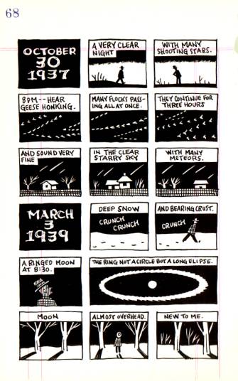
 SPURGEON: Can you talk about how the Doug Wright material went from a shared passion that you and some others shared to becoming not just a book, almost a sustained effort to re-impress Wright into our consciousness? At what point did you see this kind of project as possible? Why now and not a few years back? Because you've been reading and collecting Wright for years.
SETH: Wright has somehow become a cause in my life -- but I didn't set out to make him so. It all sort of evolved.
Throughout the '80s and '90s, I underwent a long process of attempting to educate myself on the general history of cartooning. I started broad and worked my way down to the specifics. By the end of the '90s I was mostly interested in pursuing the work of a handful of largely forgotten Canadian cartoonists. Wright was up near the top of that list. But he wasn't necessarily at the
very top.
By the turn of the century I had collected about seven scrapbooks of Wright's
Nipper -- perhaps half of his actual output. It was a tough uphill climb to get that material. I was also piling up the work of about five or six other Canadians then, too. The ultimate goal of this collecting was really just to get to know their work and to learn from it. The secondary plan was a hope to publish a collective book on the group of them. I didn't think anyone would ever let me publish a book focused exclusively on Wright, for example. I didn't know if there was an audience for such a focused book. I assumed an overview of them all was the best I could hope for. The current market really didn't seem to exist at that time. I never would have even proposed such a book as
The Collected Doug Wright. Not even in softcover. Times have changed.
I think the turning point of when Wright become more specifically "connected" to me was when
Brad MacKay came to me with the idea of creating
an award for English Canadian cartooning. It wasn't a foregone conclusion that Doug Wright would be the namesake. I recall we discussed
Jimmie Frise as well -- but somehow Doug just seemed like the correct choice. I believe it was in the creation of
these awards (both the organization and the physical awards themselves) that I first began to realize that it had become part of my "mandate" to bring Wright some of his due. The book just naturally evolved out of this sea change in thought (though this account is seriously selling short the drive and generosity of Brad and Chris in the development of this project, and I don't intend any slight here to their efforts).
Wright was a terrific cartoonist and I do want to see him recognized in Canada as a national treasure of some sort. I feel that the Awards and the book are making real steps in that direction. I would like to hope that some future artist would feel a proprietary interest in keeping me alive when I am gone as well. Perhaps this is some sort of a trust that artists owe each other.
Anyhow -- I have some hopes of this kind for popularizing the works of a handful of other Canadian cartoonist from the past, as well.
 SPURGEON: I've talked to a few people about Chris Oliveros' assertion that Doug Wright is a talent on a level with Charles Schulz and Robert Crumb, and the reservations I hear are that they don't have a sense of what Wright was trying to communicate or reveal or explore that sets him apart -- that he obviously drew magnificently well and there's an element of how he sees the world in that drawing, but he's not as psychologically piercing as Schulz or bravely confessional as Crumb. Is that an assessment with which you agree or disagree? Is there a case you would make for Wright's work in terms of that kind of depth?
SETH: I think I understand what Chris Oliveros was trying to say when he made that comparison -- I think he was merely expressing his enthusiasm for a top notch cartoonist that few people know today and he wanted to impress on them what it was like stumbling upon a cache of "unknown" work by a legitimate master cartoonist.
However, I wish he had not used the names of
Kurtzman or
Crumb or Schulz. Almost no one is in the same category as these great cartoonists, and it actually brought an unfair negative comparison onto Wright.
Let's face it: Wright is not in the same camp as those guys. They are in that rarified, top echelon of cartooning -- work that really transcends the medium.
However, it is no shame to Wright to be down a peg from these fellows. We all are. But, nonetheless, Wright was a fantastic cartoonist. Much superior to those he might naturally be compared to in the commercial world of kid strips. He's much superior (in my opinion) to
Ketcham, of whom I have seen him recently compared. He may not have infused his work with the psychological depth of Schulz's
Peanuts but he did actually create a strip of much subtly (especially evident in the work near the end of the first book and throughout the second volume to come). Wright's best work has two factors worth holding up for study.
1. Obviously, his great ability as a draftsman to capture the real world. His work, in its precise use of observed detail is a window through time. I am always amazed at the "sense of place" evident in his strips -- more so even than photographs -- in recreating in form and feeling a specific place and a specific time.
2. His focus on "the slight incident" as a subject matter for his "real life" strips. The Nipper strip starts out as a Dennis the Menace type gag strip, but it evolves. If it had stayed in that mode it would only be of interest for my first reason, listed above. However, the strip changes as time goes on. He eschews the gag format (to a large degree) focusing less on getting a laugh then presenting some quiet aspect of family life. As time goes on the strip is remarkable for its unsentimental view of childhood. He's still aiming for a chuckle but it's not the most important aspect of the strip. His subject matter is the tiniest of moments -- in the best of his strips it is often something we would barely comment upon. Truthfully, I can't think of any other comic strip like it. This aspect of his work really takes precedence in the second book -- but you can see it strongly enough from about 1960 onward.
I love Wright's work and I don't think it needs any defending. He infused the strip with his life and that makes it interesting. Sure, he didn't infuse it with his deepest inner soul like Schulz did. I regret I even have to compare them. It's true that Schulz name comes up in the book a few times but I believe we only compare him to Schulz in terms of popularity and child-baldness. Yes, they were on different levels... but Wright deserves the title of Master Cartoonist. Schulz , more likely, is in the realm of the demi-gods. Crumb and Kurtzman as well.
 SPURGEON: You did a fairly remarkable-looking strip in
 Kramers Ergot 7
on Thoreau MacDonald, and that's not someone I thought of you having an interest in before that strip. Can you talk about your interest in MacDonald and what elements of that interest drove the creation of that strip? Because part of it seems to be your capturing something about his art, and another seems to be about understanding this text in front of you. One basic question, too: why the difference in the presentation one page to the next, where you shift to journal pages?
SETH: I have been interested in Thoreau MacDonald for about eight or nine years now. This might've been more apparent to you if you lived in Canada because I gave a lecture about him at the Art Gallery of Ontario several years ago and I also published that modified essay in a Canadian magazine. If you came to my house you'd know it as well, because there are examples of his beautiful work all over the place.
TM is always up there in my mind as a potent life example -- along with
Glenn Gould and Robert Crumb. People I admire enormously and think about almost every day. He was modest and hard working and had a profound connection to the world -- specifically the fields and farms of Thornhill, Ontario (now a depressing Toronto suburb). He was smart and had exquisite, austere sensibilities and I wish I were more like him.
His book designs have had a deep and lasting impression on me. I've studied them all with laser-like intensity and have learned so much about good design just from trying to figure out why he made each of his simple choices. He was like a Shaker in his visual quietness: his regularity of beauty and form: and his austerity of presentation. TM's designs might just be the equivalent of a Bach by Gould... I look at what I am doing and seriously worry I may be
Liberace.
Anyhow -- I admire him greatly and it was probably inevitable that I would do a work connected to him at some point. The opportunity came up when Alvin called me about doing something for
KE7. TM leaped to mind instantly. His writing has always appealed to me in its directness and its honesty and I figured this would be a good opportunity to "appropriate" it. It was especially gratifying to work with his diary entries. I have read the two published books of his diaries multiple times and the writing is extremely soulful -- especially considering the economy with which they are written. The two pages are drawn in somewhat different styles in
KE7 for the simple reason that I wanted to contrast the bio with the diary pages. The Bio page was drawn with one eye on TM's own drawing -- not strictly emulation but ...with him in mind. Across the gutter, in some vague manner, I was trying to lessen my "voice" in the diary pages and so I put forward the conceit that they were drawn in a "diary-style." One reviewer (
in the Village Voice) actually thought those pages really were from TM's own hand-drawn diary (of which there is no such thing)!! Somehow I figured the subject matter was suited to that grand avenue of a two-page spread in that giant book. I had a feeling too that the life an old Canadian book designer would be the perfect subject matter for that anthology. I was especially worried that several of the young artists involved in the project might tackle the same topic. (This is a joke.)
In some ways, TM has been as overlooked as Doug Wright has. He's certainly been overshadowed by his father's (
JEH MacDonald, of the
Group of Seven) legacy. It's a shame -- he's an enormously important Canadian artist in my opinion.
SPURGEON: Are you constantly finding new sources of inspiration, new artists with which you wrestle? What are you passionately interested in right now? Are you able to tell what's going to stick with you?
SETH: Yes -- I think that is pretty typical of me. I'm culturally hungry -- always on the look out for new fascinations. I wear interests down. I get passionately interested in something and then focus deeply on it until I burn it out. Some interests last and some don't. I'm not sure if I always know what is fleeting but I always know what will last. With artists, I have a pretty clear Pantheon of personal greats -- why one might be on the list has nothing to do with building a hierarchy of merit. A lot of it is simply personal -- how something strikes you. When that certain special artist is discovered -- one who will be added to the pantheon -- it doesn't matter where they sit in the grand scheme of "art"... it's just intuitive. They hit the right chord with me. Perhaps
DuChamp,
Picasso or
Warhol are greater artists than
Lawren Harris. It's clearly true. But Harris is in my personal pantheon and they are not. Who can explain such things? (Perhaps I am just a middlebrow).
Typically, once an artist enters that pantheon I never tire of them but every occasionally someone falls out. It always surprises me. A few years ago I was kind of horrified to discover that I no longer cared for
Woody Allen. I cannot tell you how important Allen was to me. I wasn't horrified because I had no interest in his current films (why would I?) -- what bothered me was I had mostly lost interest in all his old films which I had loved so deeply. Perhaps that love will resurface. I hope so. I feel pretty indifferent on the matter right now.
Current interests.
Last Year At Marienbad.
William Christenberry.
Stephen Shore.
Thor Hansen (a decorative Canadian designer)... I've been on another
Norman McLaren kick (comes up every couple of years)... for the last several years I have been reading an enormous amount of classic ghost short stories (mostly from about 1850 to roughly 1940) -- a real pleasure. I read a fascinating "ghost " story called
The Great Return, the other day, by Arthur Machen -- an odd story that really stuck with me for some reason. Just today I could feel the excitement rising for a book I read a review of in the
National Post --
A Progressive Traditionalist: John M. Lyle, Architect.
I could go on.
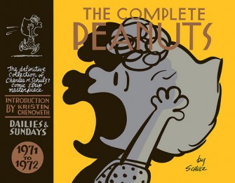 SPURGEON: I wanted to ask you a couple of questions about Charles Schulz, from the point of view of your design work on
 The Complete Peanuts
. First, is it more flattering or annoying that the sum of your design choices on that series has become the Original Eve for this latest wave of modern strip reprints?
SETH: Imitation is the sincerest form of flattery. Seriously. It doesn't bother me in the least.
I design books with my own taste in mind. I wish more books imitated my designs because then I might like them more.
That's meant to be a mean spirited joke -- not a compliment to myself. What I really mean is that I have very specific tastes and often modern book design doesn't really fit those tastes. I find a lot of modern design to be too busy. I wish a lot of books were designed more with simplicity, order and beauty in mind. To be honest -- when I look at my own designs I see the right intentions but I also see the glaring failure to achieve them (well -- some I like better than others).
It's funny that our
Peanuts design has come to be seen as "classic" because we've only been working on the series for a few years. I've actually seen the design described in those terms -- "classic." I'm not complaining -- that's very flattering. I mean, who wouldn't like to hear that? That's the dream scenario for me, isn't it? To have this series of
Peanuts books, with my design on it, to be the definitive collection of the master's work. As a child I so deeply loved
Peanuts, and as an adult I have such respect for Schulz -- I am proud to be linked with him -- even in the most insignificant way.
I recall when the first images of the design were released on the Internet, I was directed to go over to
the Comics Journal web site to see a long thread of complaints about how the design was all wrong -- too dour. Too much Seth -- not enough Schulz. A complete misunderstanding of
Peanuts, etc.
Strangely, the criticism didn't bother me. I had a gut feeling that I knew the work so well and had such deep respect for the man that I could make my own decision on the books. I still feel I made the right choices for the series. They were really the only choices I could have made. When I sat down to design the books that design almost immediately developed. The design represents how I feel about Charles Schulz and his masterpiece. It's not a calculated "graphic design" -- it's one artist responding to another.
 SPURGEON: Second, this is a question I wanted to ask anyone working with the '70s
 Peanuts
material after doing the '50s and '60s. Have you noticed the kind of visual change that everyone says started to happen in the 1970s with Peanuts
? Do you feel the strip with which you're working is different than the one with which you started working? If so, how so? And if not, is there a different quality you get from the work just paying this much attention to it as a designer?
SETH: Peanuts undoubtedly goes through some profound changes in the '70s. In a lot of ways, it's another strip ("The Snoopy Show" -- or perhaps, "Peppermint Patty's World"). However, that sort of change is pretty true of every decade of the strip. Yet, in my opinion, those shifts are not that important -- the whole strip is a continuum. I love the seventies material as much as the earlier stuff (and, to a large extent, the later material as well). Every decade of
Peanuts has its charms. I am anxious to reread all the '80s material again. I expect that we will be hearing interesting reappraisals of that work as soon as it's in print again. The thing is -- as the decades roll along the characters get older. Not in the actual ages of the
Peanuts kids themselves but in their voices. Schulz gets old and so do the characters. He's in his fifties in the '70s and you can see the reflective voice growing deeper in the strips. You can feel the accumulation of years in the voices of the characters.
By the time you reach the end of the strip in the '90s the "gang" are all old people. Just look at Lucy -- she's even drawn as an old lady. Where is her little dress she used to wear? She's in sweatpants and an old lady sweater. The very center of gravity changes in the drawings of the characters. They are undeniably senior citizens. They have old voices.
It's a great strip all the way through, though.
My design for the books takes some of this into account -- but it's not a big part of it. The endpapers will reflect the growing minimalism of the backgrounds. The color schemes of the books reflect the changing mood of the times. Etc. The main thing about the design is that it is meant to be simple and to allow the strips the dignity they so richly deserve. You cross the grass lawn at the beginning of the book and enter Schulz's reality and then at the end of the book you exit out the same way.
 SPURGEON: Can I ask after your general approach to designing the John Stanley books? You've written well about him in the past, so it's obviously an artist you enjoy. I wonder specifically how you avoid repeating yourself taking on yet another high-profile project like this one. What does Stanley bring out of you that maybe your other design assignments don't?
SETH:Like everything I do, I am bound to repeat myself. It's what I am all about. I like repeating myself. That's what I liked so much about my Mum and my Dad. They constantly repeated themselves.
I love
John Stanley. He's way up in that personal pantheon of mine. The entire design of the series was inspired by Tom Devlin when he spoke these words to me over the phone: "John Stanley Library."
That was it. I immediately knew I wanted the books to look like a set of old time children's encyclopedias. I love the look and feel of those books -- specifically the '50s/'60s sets. What was great about them is that many of them still had '30s surface stylings to them. They were brand new '60s books but they felt instantly old. Hence, my plan.
I know that
seeing the designs for Melvin on-line probably doesn't transmit that feeling but when you see the physical books -- especially when they start to pile up and you have a handful of different volumes stacked up -- you'll see what I am going for. I think the online pictures make it look like it's got some sort of fancy art deco design going on. I can see why you might think that (and why people might think that's a really bad design choice) -- but really, with the endpapers and the texture of the cover stock and the shiny seal on the back -- it will read "encyclopedia." But, of course, encyclopedia with a fun cartoon character front and center. I think kids will respond to the design. I think it has kids written all over it. But then again, what do I know? No one is less involved with children today than I am. Do kids even read books any longer?
That last part of the question -- "What does Stanley bring out of you that maybe your other design assignments don't?" That brings us to a real problem with me as a designer. The truth is, when I design something it
really is too much about me. I'm responding to Stanley with the love of another artist. I'm trying to create a package for him that is a tribute to him. It's not really how designers classically work. I think the best graphic designers try to remove themselves from the picture and create a package that is suited to the work being packaged. I don't really think that way -- I can't keep myself out of the process. My designs end up having a bit too much of me still in the picture. It's that way with Schulz, it's that way with Stanley and it is certainly that way with Wright. I'm probably not a very good graphic designer for that reason.
 SPURGEON: I'm catching you right when you're about to head out on tour... you've been around long enough to know what things were like before the more sustained interest in a wider range of comics. Are you happy with the way things have developed in terms of the art and industry and opportunities that are there? Is there anything that you wish had happened that has yet to happen in terms of the arenas in which you work?
SETH: I am happy with the way things have gone.
I often repeat this story. Around 1999,
Chester Brown and I were in a restaurant and I recall things looking really grim. We were worried that the whole comics "thing" was coming to an end. I cannot remember what exactly sparked these worries but I recall we were discussing what we would do if the publishers went under. This seemed a valid worry at the time. Would we go back to Xeroxing? How would we make a living? Chet and I decided we had hitched our wagons to a falling star. Who knew back in the '70s, when we were teens, that comic books (which seemed a mass medium at the time) were actually the modern equivalents of the dime novel. Doomed to extinction.
And then -- everything changed.
It's a better time now. It may not last, but it really is a golden age. I feel a real enthusiasm about the medium. There are a lot of exciting young cartoonists coming up -- more than have ever been.
Great works are being published every year. Works that will be considered classics in the decades to come. The very vocabulary of the cartoonist's language is expanding as great cartoonists continue to add to it with their ambition and genius.
As a working artist, each day remains a struggle -- to try and make good work. To try and get better -- to learn. To try and balance the commercial work with the personal work. Frustrating. Life gets sadder as you get older... but it is a fulfilling struggle. Art is like a religion. You have to have faith in its transformative power.
*****
* cover to
George Sprott, 1894-1975
* page from
George Sprott
* page from serialization of
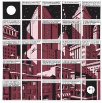
George Sprott; I just like that cityscape backdrop
* pair of panels from sequence in
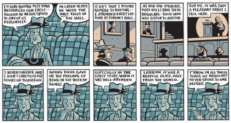
George Sprott
* one of the color shifts in
George Sprott
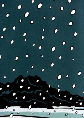
* a silent page set in Sprott's past
* part of one of those two-page, abstract spreads
* one of the building model photographs
* a full-page image from
George Sprott
* a comic within a comics page from
George Sprott
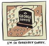
* a tiny panel from
George Sprott
* Doug Wright panel
* book cover to new Doug Wright collection
* Doug Wright illustration
* from the Thoreau MacDonald story in
KE7
* one of Seth's more recent covers from the
Peanuts series
* image from a Seth end paper in the
Peanuts series
* a John Stanley Library cover
* a Seth illustration
* a single image from a
George Sprott page (below)
*****
*
George Sprott, 1894-1975, Seth, Drawn and Quarterly, hardcover, 96 pages, 9781897299517, 2009, $24.95
*
The Collected Doug Wright Vol. 1, Drawn and Quarterly, hardcover, 240 pages, 9781897299524, May 2009, $39.95
*
Thoreau MacDonald, Seth, KE7, edited by Sammy Harkham and Alvin Buenaventura, Buenaventura Press, 2008, $125
*
The Complete Peanuts, Charles Schulz, book series, Fantagraphics
*****

*****
*****
posted 8:00 am PST |
Permalink
Daily Blog Archives
November 2019
October 2019
September 2019
August 2019
July 2019
Full Archives


