April 20, 2008
Emptying The Big Basket 04
CR receives two to three comics a day. That adds up. It's more than we can handle in our 200-plus regular reviews a year.
Some comics are reviewed right away. Some comics are never going to be reviewed. The remainder go into a giant basket. When the basket is full and must be emptied, it's time to run whatever commentary we can muster. It may not be a full review -- and even that ain't much -- but least it's something.
We greatly appreciate you sending in your material for review. Thank you. It helps us track what you're doing, and what's going on in the field. All of it gets read. If it doesn't end up reviewed that's my fault for not coming up with a proper idea. I hope you'll forgive me.
*****
 Title:
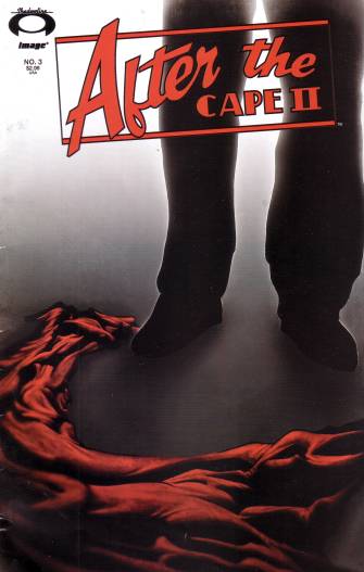
 After The Cape II #3
Creators: Howard Wong, Jim Valentino, Sergio Carrera, Ed Dukeshire, Kristen Simon
Publishing Information: Image Comics, comic book, January 2008, $2.99
Ordering Numbers:
This is one of those comics where the superhero genre is given a "realistic" treatment, only the realism involved is based on the world of really low-budget spy thrillers and adventure movies -- something that might star Steven Seagal or Brian Bosworth or Patrick Swayze's brother. There's something appealing about marching superheroes through a scenario of dire consequences, I think because like it or not that choice ends up acting as a critique for a violent sub-genre that almost never factors in the outcomes of its violence. Giving a kind of pulpy, lurid sheen to those plot developments fairly ruins any beneficial aspect to such choices, and instead tries to provide the story with a heightened "cool" -- genre correction rather than genre criticism. I might have found the whole thing pretty cool when I was immersed in the tropes of mainstream comics at age 11, but even then I probably would have known about much better examples of this kind of outing.
*****
 Title:
 Batman #671
Creators: Grant Morrison, Tony Daniel, Jonathan Glapion
Publishing Information: DC Comics, comic book, 32 pages, January 2008, $2.99
Ordering Numbers:
This book was so ordinary I actually bought it twice. While I generally like Grant Morrison's superhero work, and I hear good things about his Batman, this just seemed like a mess to me. I still have a hard time remembering it. It's a storyline featuring the world's most overrated, boring A-List bad guy, Ra's al Ghul, kind of a living embodiment of 1970s distrust of/fascination with Middle Eastern culture. This is bad enough, but it also seems to involve a fruit tree's worth of easily pluck-able backstory details from that character. I wanted Batman to be rescued from his predicament just to get him away from the story, if you know what I mean. Maybe the story got better as it went but it seems like Morrison decided that a certain subset of 1970s was awesome and didn't need to be revamped as much as burdened with a lot more in the way of specific plot points.
*****
 Title:
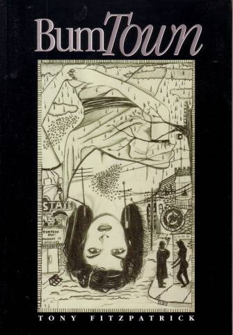
 Bum Town
Creators: Tony Fitzpatrick
Publishing Information: Tia Chucha Press, softcover, 48 pages, 2001 $16.95
Ordering Numbers: 1882688252 (ISBN)
The book that changed the direction of painter, printer and poet Tony Fitzpatrick's career falls more into a broad and forgiving definition of comics work than any of the other books currently in the basket, but there's plenty of interplay between text and image for those that look. Anyway, who cares about definitions when a work is this enlightening and impressive? Published by (I think) an imprint best known for poetry rather than art books,
Bum Town found Fitzpatrick in the late 1990s focusing his one-time scattered impulses and cultural insights (best seen in his
Hard Angels) into a more thorough examination of place and past. This leads to several beautiful evocations of his father's view of a world that's since slipped away without Fitzpatrick being able to grasp onto its value, at least not until almost a shadow of it is all that remains. There are also a series of lovely portraits very different from the color paintings the painter does now, blending his powerful collage work with stronger figure and object drawing than I think he's done before or since. If you were ever one of those college kids buying John Fante books or Kerouac's
Tristessa on your charge account at the university bookstore and sneaking reads at the back of class, you owe it to yourself to experience what may be Fitzpatrick's best book.
*****
 Title:
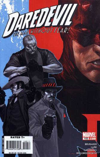
 Daredevil #102
Creators: Ed Brubaker, Michael Lark, Stefano Gaudiano, Matt Hollingsworth
Publishing Information: Marvel, comic book, 32 pages, 2007, $2.99
Ordering Numbers:
I enjoy reading Ed Brubaker and Michael Lark's run on
Daredevil when I catch up to issues, but I can see why some readers who tell me they've dropped the series have done so. The writer Brian Bendis had a couple of advantages in his long and well-received run on the Marvel character that preceded Brubaker's that Brubaker simply doesn't have with his. Bendis may have at that time been slightly more skilled with quirky elements of long-time fan service than Brubaker is, those exaggerated elements of plot and personality that put a smile on a reader's face even when they don't always get the context and delight those that do. (At the very least, he got to apply this to core elements of the franchise rather than outside guest stars, like this story's old
Spider-Man baddies The Enforcers.) Much more importantly, Bendis' run followed a lot of bad, overwrought comics and years of inconsequential ones. Like Grant Morrison's run on
New X-Men, Bendis'
Daredevil opened eyes by repeating the most successful thematic/narrative arc of past Daredevil runs (Daredevil laid low), tweaking it (this time it's his own fault, not simply that of an outside actor) and driving it towards a sensible, non-standard comics resolution (Daredevil goes to jail).
The problem is that Daredevil doesn't seem to have a variety of successful thematic/narrative arcs to choose from, so Brubaker's best avenue for creative viability is to continue on and perhaps deepen the path that Bendis just explored. Had this run come five or ten years from now, after some dingbat had changed the character into an actual demon that fought with the Son of Satan and then made Matt Murdock a lawyer that had wacky courtroom adventures sharing an office with She-Hulk followed by several lighthearted issues set in Asgard followed by a gothic romance with the Scarlet Witch called "Agony in Red," people would be falling all over themselves to praise this return to basics. As it is, the Brubaker/Lark run is bound to be under-appreciated for as solid a piece of superhero entertainment as it offers.
*****
 Title:
 The Incredible Hulk #112
Creators: Greg Pak, Fred Van Lente, Khoi Pham, Stephane Peru
Publishing Information: Marvel Comics, comic book, 32 pages, January 2008, $2.99
Ordering Numbers:
This is the first issue in this title's transformation, asserted as permanent, into a series featuring Marvel's version of the Hercules character, one of Jack Kirby's more underrated designs and the only star of 1980s mainstream comics that I don't think has had an extended chance to helm a modern comic book. I think I would have liked it when I was 12. They team Hercules with a newer, troubled boy super-genius character and give his second-rate status some context by pointing out many of his classic endeavors arose from his screwing up first, or at least being used against his will. Marvel does over-smart geniuses and muscle-heads pretty well, and this seems like the kind of thing that a lot of older fans will enjoy a lot. Too much of it bores me in a way that spoils the investment I'd have to make in the title to share those feelings, but that's pretty much true of every serialized superhero comic. I suspect that this will be talked about by devoted comics readers on-line and casually mentioned as a title to check out by shop owners more than it will enjoy runaway success, but there's a place for those kinds of comics, too.
*****
 Title:
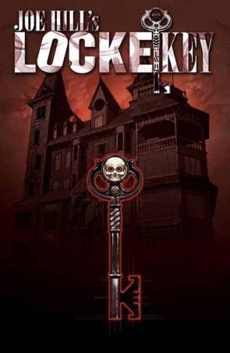
 Locke and Key #1
Creators: Joe Hill, Gabriel Rodriguez
Publishing Information: IDW, comic book, 32 pages, $3.99
Ordering Numbers:
You can practically see the movie that
Locke and Key stands a great chance of becoming peeking out at your from the pages, and what odd about this project over a dozen similar ones is that its comics elements seem to work at cross-purposes. The oddly stylized art of Gabriel Rodriguez provides a lot of the energy you see here -- his leering characters and oddly-shaped figures give the work a kind of cartoon bounce that's reminiscent of Steve Dillon's work. There's no way that could replicated on film, and without it you're left with a fairly straight-forward story where the supernatural either directly results from or directly comments upon a family tragedy. What's most promising are a few pages where panel transitions underline the thematic concerns in play rather than simply mark narrative progressions -- that's not an easy skill to master for any writer, let alone one with a first gig in comics. Ninety-nine percent of the decision to be made whether or not the comic ends up being worthwhile has yet to be revealed in actual comics pages.
*****
 Title:
 Ma.B
Creators: Graeme McDonald, Dave Cunning, Chris Catlin
Publishing Information: Local Act Comics, comic book, 2007, no price.
Ordering Numbers:
There's probably a germ of a decent story in the concept of a woman on the run who finds refuge in one of those shady cult-communes that periodically appear in the news in an unfortunate way; unfortunately, this is way too crude for me to even be all that sure that's what is going on here, let alone recommend the work. I couldn't tell what was going on half the time: the characters weren't recognizable from panel to panel, the scenes sometimes dropped backgrounds entirely, a lot of the dialog was exposition instead of naturalistic, and the humor -- I think it was humor -- fell flat. This is the kind of work that shouldn't be published but be done and put in a drawer until everyone gets a bit better at making comics.
*****
 Title:
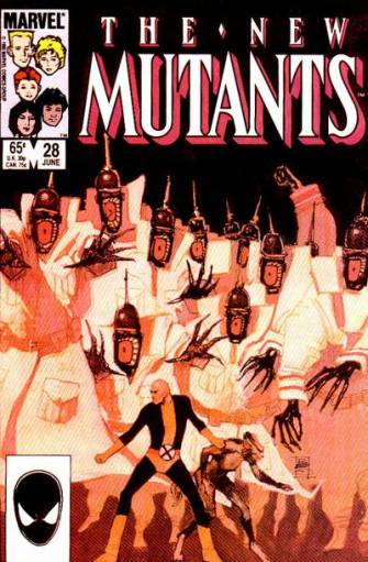
 New Mutants #28
Creators: Chris Claremont, Bill Sienkiewicz
Publishing Information: Marvel Comics, comic book, 32 pages, June 1985, $.65
Ordering Numbers:
New Mutants #28 came out during Bill Sienkiewicz's fondly-remembered run on the title, during a period in Marvel's history where Sienkiewicz had assumed from Gene Colan the honor of being the only artist who didn't have to draw in an approximation of mainstream style. The end result is a comic that relies on abstraction a bit too much for my tastes -- there's barely any difference in quality and detail between the real-world scenes and the one that take place in an imaginary mind-created illusion -- but that's much more readable than the pre- and post-Image flood about to hit in a half-decade. The style isn't anachronistic as much as the silly outfits and bizarre haircuts. Magneto in particular looks like an extra from a punk rock scene in a Michael J. Fox movie, or something Yahoo Serious might play, but there are weird cuts galore on both men and women. In terms of story, it's a fairly fascinating from a kind of geek anthropological standpoint: you can see the characters starting to become strained, picking up major plot elements that simply don't stick with the same weight as earlier developments. Not only did I have to go look up Lee Forrester, I had forgotten the fairly intended to be major development that Professor X had a son, let alone one with the Crazy Jane-ish plot construction of a different mutant power for different personalities. It's still a lot fresher than the franchise today, and I don't know that I consider the then forthcoming big guns phase more than an unfortunate side journey, but even at this point you can start to see the flesh take on that icky shine.
*****
 Title:
 Savage Dragon #134
Creators: Erik Larsen, John Workman
Publishing Information: Image Comics, comic book, 32 pages, November 2007, $2.99
Ordering Numbers:
The virtues of
Savage Dragon are Erik Larsen's loose, casual art; his adherence to 1970s-style accumulative continuity and his relatively lighthearted take on the more serious injury and death elements of the Image correction of Marvel Comics. This issue stars another Image character, Bomb Queen, that I assume has a satirical side to her because otherwise this is the worst character that was ever created. It seems like clumsy satire, anyway, basically the surface elements of Tank Girl transposed into a superhero comic (with corresponding bigger boobs). The problem with this comic is that if you aren't already sold on Larsen's combination of offerings it's not likely any single comic book is going to get you there, and I wandered through most of this with a sense of bemused detachment. One thing about Larsen's adjustment in style that I hadn't noticed before -- it seems to play hell with his figure-drawing perspective.
*****
 Title:
 Jenna Jameson's Shadow Hunter #1
Creators: Jenna Jameson, Christina Z, Mukesh Singh
Publishing Information: Virgin Comics, 40 pages, February 2008, $2.99
Ordering Numbers:
There's some pretty art in this comic, of the modern superhero-fantasy comic book variety. I'm not familiar with Christina Z, but there's a delicate verve to her over-stylized figures, and her feathery, icky monsters prove more entertaining than not. One of those stories about a put-upon average person who finds out they're an important figure in a fantasy conflict that intrudes upon their life, this comics unfolds as if the demands of modern comics find and punch until its unconscious all the usual requirements of story. There's no depiction of the life our protagonist leaves behind, there's no baseline by which we might come to a decision about the fantastic nature of the protagonist's new world, there's no reason at all to root for the interest other than that she's drawn to be attractive and the story seems to be about here. It's almost lunatic in the way it gives itself over to the punch-pull requirements of modern Image-style fantasy comics. One ends up exhausted both by the relentless, herky-jerky nature of our hero's story but also by the fact that every single thing about it familiar in the way one might see a poker hand picking up a random collection of cards on the floor. Just a mess.
*****
 Title:
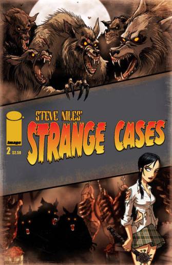
 Strange Cases #2
Creators: Steve Niles, Dan Wickline, David Hartman, Jason Hanley
Publishing Information: Image Comics, comic book, 32 pages, November 2007, $2.50
Ordering Numbers:
This is such a forgettable comic that I can't even remember why I held onto it in order to review it; the Steve Niles-created, Dan Wickline-written story doesn't really encourage deep analysis. A ridiculously tiny, attractive girl connected in some way to some sort of agency that I suppose handles occult overtone cases beats her way in impossible fashion through a scenario involving werewolves that feed on bums they attract to their lair through the promise of high-paying bum fights. The bum fights thing doesn't make a lot of sense generally -- why would a greater number of people respond to a chance to have their teeth kicked in than to some more pleasurable offer? -- but it does explain why the humans involved are asked to bulk up first and why no one is greatly concerned by the absences, which are important plot points. For the most part, what I got out of this book was a feeling that the story was removed from the oven a half hour before it cooked. We've seen a petite, attractive ass-kicker before, and there's nothing unexpected to or compelling about this one that makes me interested in reading her adventures.
*****
 Title:
 Superman Confidential #5
Creators: Darwyn Cooke, Tim Sale
Publishing Information: DC Comics, comic book, 32 pages, June 2007, $2.99
Ordering Numbers:
When buying comics from your video store's poorly assembled spinner rack, it's good to go with the big names. And in terms of this decade, there are probably no more consistently interesting creators working almost solely in superhero comics than Darwyn Cooke and Tim Sale. This issue is the five book in what I think ended up being a six-part series where Superman meets an alien that accompanied him to earth. That alien shows him a bit of his heritage and also exposes him to the concept of Kryptonite. Cooke press the importance of that Superman-poisoning material by suggesting it's the only way the big guy has truly known mortality, or at least how he first got to know. Writing for DC's peculiar Byrne-plus-everyone-since-Byrne conception of the superman character can't be easy. All the original detritus of the character's first 45 years are still there, just in less compelling iterations. He finds a nice balance between bringing in classic character elements and DC's modern take, such as it is. Tim Sale draws nice-looking characters, although I always think there are about ten people in the entire world when he does comics.
*****
 Title:
 Tales of Suspense #74
Creators: Stan Lee, Gene Colan, Jack Kirby, George Tuska
Publishing Information: Marvel, comic book 32 pages, February 1966, $.12
Ordering Numbers:
The best thing in this issue is the conclusion of one of the better little kids' adventure epics from late in Marvel's 1960s glory period, the Lee/Kirby/Tuska Sleeper Saga. In this story, Captain America fights giant robots that the Red Skull and the Nazis hid underground in case they lost the war, at which point they'll spring out and kill the entire world. It doesn't make a lick of sense, but it's fun to watch a completely overmatched Captain America continue to press until he finds a way to overcome the threat. The robot designs are also cool and refreshingly old-fashioned, especially when they combine into one demented-looking juggernaut straight from the cover of a heavy metal album. The Colan story is quite handsome -- he was still Adam Austin at this point -- although it's in that phase where the Iron Man comics were shifting heavily towards soap opera and really, really lengthy snippets of dialog. A whole bunch of great early Marvel sequences are available in their original format for not bad prices, and I totally encourage any and all comics fans to target and buy a few. I love the Essential collections and I admire some of the slick reprinting efforts, but this is one case where the original format really served that material best.
*****
 Title:
 Tales Of The M.I.A.C.
Creator: Ed Mulreany
Publishing Information: Self-Published, comic book, 20 pages,
Ordering Numbers:
Since there's no date, no inside covers, and no price on this simple black and white vanity press project, it's hard to hold it to a high standard. Further, one might want to overpraise it because of the homemade factors, both to say one discovered the talent involved and because to criticize it is like pounding a high school drama club production of
Our Town. All that understood, this is not a good comic. It's an anecdote told in comics form, but with the focus on the people telling and hearing the anecdotes, done in a static, no-background style that's really not much better than a low-end greeting card. You'd have to be Harvey Kurtzman or Peter Bagge to make an entertaining comic out of that presentational choice, and this is universes away from a book offering that level of talent. This should have been a mini-comic, and it would have an undistinguished work in that format as well. I know the cartoonist means well, but there is just not enough work put into this book, and it fails on a fundamental level. Maybe if it's a giveaway people might find it appealing enough to read and sample Mulreany's talent, but I can't see this holding up its end in any other kind of exchange.
*****
 Title:
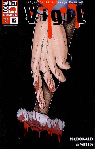
 Vigil #2
Creators: Graeme McDonald, Colin Wells, Dominic Davies
Publishing Information: Local Act Comics, comic book, 2007, no price
Ordering Numbers:
I mostly just wanted to list this book because I love the tagline "Vengeance is a Savage Messiah," as seen on the cover above. That's not only catchy; like most great action story slogans, it makes absolutely no sense at all. There's nothing as great as that in the comic itself, which is executed in very crude fashion by the writer and artists -- so crude I couldn't immerse myself in it for long enough to figure out what was going on. It seems to be about violence, which is a nice choice but something that probably deserved a greater amount of consideration and care that what's provided here.
*****
 Title:
 The Order #1
Creators: Matt Fraction, Barry Kitson, Mark Morales, Dean White
Publishing Information: Marvel, comic book, 32 pages, September 2007, $2.99
Ordering Numbers:
The great thing about discovering an offbeat adventure comic book like this from one of the Big Two is that 98 percent of the time it's not going to last 12 issues, so you know that at some point you'll be able to pick up the whole thing in someone's dollar bin or as a way to get your mail-order up over the free postage threshold. The big companies just aren't set up to support lower-selling work and to routinely generate hits, which is a difficult task anyway because of the overripe quality to those milieus, in the same way that TV shows tend to launch spin-offs in peak seasons and not their final few years.
This was the first issue in writer Matt Fraction's ambitious reworking of the old
Strikeforce Morituri formula, where in the post-
Civil War Marvel Universe people can become superheroes for one year before the bodies rejects the changes; if you think it's funny that in 2008 you lose your fame and meta-human status in LA rather than your life in a war against alien oppressors, this comic may be for you. I said "ambitious" not because of the thematic range -- it's a pretty typical Marvel comic book in that fashion -- but because of some of the overlapping, executable ideas, and a presentational style that less splash page after splash page than a variation on Howard Chaykin circa 1983. I look forward to having them all.
*****
 Title:
 The Short Term
Creators: Nick Jeffrey
Publishing Information: Floppy Comix, comic book, 32 pages, 2006, $3.50
Ordering Numbers:
This old-fashioned comic book is the out-of-left-field surprise of the basket: a flawed but mostly solid short story about a life in free fall that by tale's end is either corrected or reinforced into damaging, unhealthy patterns. It's a crude book. The artist doesn't yet have as much control over his art as many cartoonist come to develop, and the resulting variations in the texture of the book can be jarring, like a director having to switch film stocks. Equally disconcerting is a tendency to let some of the more poignant dream-like imagery seep into the real world not in a way that reinforces or establishes tone but more because of what seems like a whim of the artist. Yet there's something here. The ambivalence of the lead is appealing, and the emotional distance he keeps from the minor horrors of his downward cycle seems well-observed, even against an occasionally exaggerated backdrop. I'd read more comics from this cartoonist, although I'd do it with the hope that he had more than this kind of story to tell.
*****
 Title:
 The Megas #1
Creators: Jonathan Mostow, John Harrison, Peter Rubin
Publishing Information: Virgin Comics, comic book, 48 pages, $2.99
Ordering Numbers:
In what if this were a good comic would be a completely unnecessary explanation up front, director Jonathan Mostow tells us that this comic book of life in a United States created by monarchists has a satirical aim in showing how our own society functions in terms of stratification of privilege. Fair enough, but what follows is a resoundingly dull first few moments of a rote people-in-power murder mystery interspersed with speculative future panels like showing the "White Palace" on Pennsylvania Avenue. What the creators miss in bringing this movie pitch into comics as opposed to the big screen is that narrative-heavy comics depend a lot of atmosphere and the execution of an immersible world. This is like a movie played in front of a theater curtain by actors that failed to nab a part in this season's WB soap -- there's little that distinguishes the world being depicted; all of the characters seem handsome and bland, nothing about the mystery presented proves intriguing. Throw in what may be the most jarring coloring effect featuring white hair that looks like a little kid went after one's comic with a bottle of whiteout, and what you have is a movie on paper without the ability to change the channel to Sportscenter.
*****
 Title:
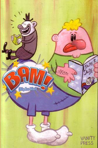
 BAM! (Big Ass Mini)
Creators: Various
Publishing Information: Vanity Press, softcover, 500 pages, $25
Ordering Numbers:
This is a huge softcover collection of a lot of amateurish work presented with a kind of chip on its shoulder, as if the heaving collapse that is a lot of its art and writing is actually such a collection of special voices and visions that any reader who doesn't like it simply can't handle their raw, unique power. That makes it not just a bad collection, but an annoying one, one that reeks of unearned arrogance, and ironically one where a lot of these supposedly distinct voices quickly begin to run together into a rushed, poorly drawn and uninterestingly told stew. The best comics are from people you've heard of: Art Baxter (why is no one publishing Art Baxter?), K. Thor Jensen and Mandy Ord. I really wanted to make a new discovery or two here, because it was a significant investment in time to sit with this giant thing on my lap for a couple of hours. Unfortunately, no such luck. I get books like this for free and I'm still pained by the experience. I have no idea why this work couldn't go into several mini-comics or even on-line.
*****
 Title:
 100 Days of Monsters
Creators: Stefan G. Bucher, Various
Publishing Information: How Books, Hardcover, 224 pages, March 2008, $19.99
Ordering Numbers: 1600610919 (ISBN10), 9781600610912 (ISBN13)
Stefan G. Bucher's fun on-line monster-drawing exercise, which blossomed when contributors began to submit stories about individual creatures, makes a less interesting book/DVD set, and I'm not exactly sure why. It may be that the print half of the work doesn't seems as much fun. The ink drawings aren't wildly different in tone and in the artistic flourishes Bucher favors, and the stories are fun and wonky but sometimes not polished -- the end result seems slightly overwhelmed by the hardcover presentation. In other words, it's the exercise and the video part that was notable about the project, not the stunning excellence of the results; it's not something that appeals in distinct fashion away from the enjoyable, creative aspect of the experiment.
*****
 Title:
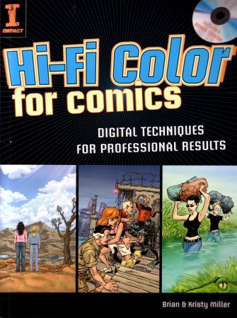
 Hi-Fi Color For Comics
Creators: Brian and Kristy Miller
Publishing Information: Impact, softcover, 160 pages, 2008, $24.99
Ordering Numbers: 1581809921 (ISBN10), 9781581809921 (ISBN13)
It's hard for me to judge the quality of a book like this without trying to apply the knowledge contained therein, and I'm not about to digitally color any comic books any time soon. It may help the potential reader to know this includes a CD full of information, and that it contains a few warning signs: I've never heard of the authors, their bios up front stress their enthusiasm and passion for the subject over their qualifications, and Impact books in general tend to be bright and pretty and focused on one or two aesthetic schools without much thought for the full diversity of its chosen subject matter. Samples of Terry Moore's work is included here, so at least it's not as superhero- and adventure-comics focused as some other Impact efforts I've scanned. Moore also endorses Brian Miller professionally. Anyway, this note indicates the book is out there, and I'll trust that any interested buyer with more passion and skill with the subject matter will put their ass in a puffy chair at Borders before deciding whether or not to make a purchase.
*****
 Title:
 A Sinner's Progress... The Beast Years Of My Life
Creators: David Sandlin, Gina R. Binkley, Dennis Harper
Publishing Information: Georgia Museum of Art, Mini-Comic, 12 pages, 2008
Ordering Numbers:
This is a museum catalog, with a smart essay that's not signed, I'm going to guess by curator Dennis Harper, related to to the David Sandin show at the University of Georgia / Georgia Museum of Art that ran February-March of this year. It's a handsome little thing, reminiscent of a mini-comic in size and heft, and valuable for a couple of reasons. One, I can't recall any essays about the increasingly visible Sandlin before this one, and two, it provides a bibliography for an artist who has worked in a variety of different formats and forms. But even if you obtained it just for the handsome reproductions, that would work, too. I'm extremely grateful for this little book.
*****
 Title:
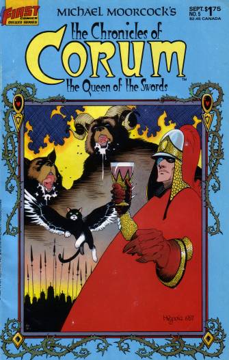
 The Chronicles of Corum: The Queen of the Swords #5
Creators: Mike Baron, Mike Mignola, Kelley Jones
Publishing Information: First Comics, comic book, 32 pages, September 1987, $1.75
Ordering Numbers:
If you can ignore the choking noises from the Direct Market system having to try to process so much work when it's not really built for it, one of the great joys of the massive amounts of comics publishing seen over the last 20 years is that it's kind of made a necessity of dumping into bargain bins to simply move material out of shops. Unless you're a major on-line retailer, you simply don't have to exposure to enough customers to pretend you can get $4.50 for every book that's crossed your sales counter. That's the long way of saying I bought this for a quarter. This is a story featuring one of Michael Moorcock's lesser-known characters, Prince Corum, in a narrative that features a lot of advancing armies and strategy and political maneuvering. Mike Baron's script is extremely strange, and without knowing the source material I'd guess it's diligent but cursory in a way some of the other Elric adaptations aren't. Mike Mignola inked by Kelley Joney is a strange combination, but a fairly effective one in terms of design. The most striking visual element is the weird, 1980s coloring that looks like it only applied colors one might have found on various pairs of aqua socks.
*****
 Title:
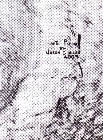
 Deth Pledge
Creator: Jason T. Miles
Publishing Information: Self-Published, mini-comic, 24 pages, 2007, no price
Ordering Numbers:
I'm not certain I can provide a review for Jason Miles' book of abstract designs. I believe some are pulled from blown up Xeroxes and some aren't, but that really doesn't matter. I enjoy the texture of the art included, and enjoy looking at the pictures. They look like nightmare images and I couldn't help but feel a bit of panic and a feeling that I wasn't seeing everything that's there. The reason I mention this book on this list is that I hope you'll keep an eye out for Miles' comics at conventions and the occasional store. There's nothing quite like them going right now.
*****
 Title:
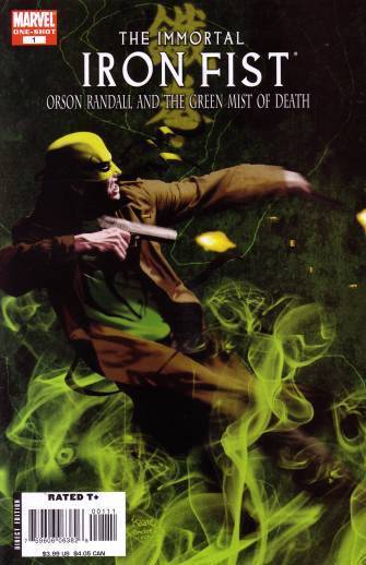
 The Immortal Iron Fist: Orson Randall And The Green Mist of Death
Creators: Matt Fraction, Nick Dragotta, Mike Allred, Laura Allred, Russ Heath, Lewis LaRosa, Stefano Gaudiano, Matt Hollingsworth, Matt Breitweiser
Publishing Information: Marvel Comics, comic book, 48 pages, April 2008, $3.99
Ordering Numbers:
My mother liked this comic. I don't know what that has to do with anything, and she kept calling it "Iron Man," but I thought that worth mentioning. I liked this comic, too, an unabashed wallow in the pulp sensibility that writer Matt Fraction along with Ed Brubaker brought to the series re-launch about a year or so ago. It's a pretty typical comic of its kind: a series of story with a couple of connecting elements, general weirdness, and a variety of guest artists. It stars the previous holder of the Iron Fist mantle, Orson Randall. Matt Fraction does a better job than most in keeping all of this moving rather than having it come across as an exercise in utilizing his editor's artists Rolodex and a writer's late-night story notes. There's a poignant element to the way they've set up Iron Fist that draws on the fact that the character is supposed to be a champion of this Himalayan mystical city yet spend most of its time in the rest of the world, disconnected from their roots -- a feeling of being without roots that anyone who lives far from home can relate to. If you want to check out what's been done with the character in convenient done-in-one form, this is the book to pick up. Plus, you know, Russ Heath!
*****
 Title:
 Nexus #100
Creators: Mike Baron, Steve Rude
Publishing Information: Rude Dude Productions, comic book, 56 pages, January 2008, $4.99
Ordering Numbers:
I take a great deal of pleasure out of simply sitting back and enjoy Steve Rude's luxurious art, crowded pages and smooth physical transitions, so it's hard for me to take an individual issue of
Nexus and figure out if I'm actually enjoying the book -- I'm not sure I really read these things until the entire mini-series is over, and we're only on issue #2. In this installment, Nexus deals with an increasingly hostile religious movement and the disappointment that his once-promising planetary community has obviously slipped into a state of disarray. I found the main kind of duller than dirt for the space of one issue, to be honest (improvement in that department when seen over a four-issue run is more than likely), and the series' sub-plots lack the potency they used to generate back in the book's monthly serial days. The incidental moments are worth it all by themselves if you're a fan of Baron and Rude, the out-sized character moments and the physical interplay between the Loomis-like Nexus and Sundra Peale. Another thing the books gets right is the way characters float in and out of the story in both a physical and in a willing involvement sense; they're missed but it doesn't feel like they should be there. Life goes on.
*****
 Title:
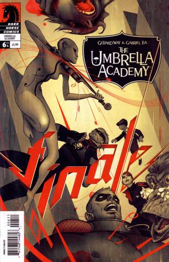
 The Umbrella Academy #6
Creators: Gerard Way, Gabriel Ba
Publishing Information: Dark Horse Comics, comic book, 32 pages, February 2008, $2.99
Ordering Numbers:
I wonder if the pendulum will swing back the other way regarding opinions on Gerard Way's debut big-publisher series: it really was more accomplished and better crafted than anyone could have expected, but it felt kind of like a Wes Anderson movie that didn't quite become its own thing. In this case it's the Glass children stories but Grant Morrison's late '80s/early '90s comic book that are being picked up and covered with kisses. Part of the series appeal, I think, is that there simply weren't enough series like this after Morrison burned through them and moved on, so there's a great deal of pleasure in having those buttons pushed again. Still, by this sixth issue I kind of last track of the emotional through-line and by the book's closed I was glad for what never became more than character roughs to fade from view again. The real strength of the book was Gabriel Ba's lovely art, reminiscent of Morrison collaborator Richard Case in some of its out there, more angular designs but much more fluid and generally dynamic.
*****
*****
posted 8:00 am PST |
Permalink
Daily Blog Archives
November 2019
October 2019
September 2019
August 2019
July 2019
Full Archives